14 Jul 10
I just realized I never wrote a leader for this post, so here goes: nerdery abounds at redesign time.
JQuery. I’m pretty sure that’s where this all started. A few months ago I redid my work site in effort to add a little more, well, pop. In doing so I had a little discussion with JQuery and we decided that it would be fun to hang out some more. Since then it’s been finding its way into more and more of my projects, as it’s proven to be remarkably useful.
As I become more familiar with it, it’s easier for me to see what it’s capable of (hint: everything), and as a result I started thinking about a redesign of this blog in an effort to completely and utterly abuse integrate some of those capabilities. As work progressed, I realized there were some other bullet points I’ve been wanting to hit as well. Here’s the laundry list:
JQuery
Like I said. In this case I’m using it mainly for the archive dropdown and the endless scrolling on listing pages. I played with some concepts that involved more horizontal scrolling, but decided to ultimately go a different direction.
Grids
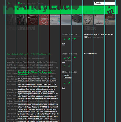
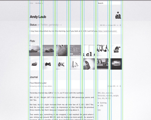
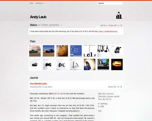
I’ve been basing the various iterations of this blog off of grids for a long time, but this is the first time in awhile where said grid hasn’t been dictated by Flickr. In this case I decided to try a 960 grid system and ended up using a 16 column grid here, with each column equaling 50px with a 10px gutter. I used this CSS generator to develop the initial CSS.
I’m debating whether I’d use this technique if I were to do it all again as I had a couple of hangups with the process:
- I didn’t love the naming conventions for the various classes; I ended up replacing all the underscores with dashes because that’s what I’ve become accustomed to using in my CSS.
- The system falters somewhat if you’re floating multiple blocks inside of a larger block (for example, three
.grid-3‘s in a .grid-9. You need to add .omega (to remove the right margin) to the last block in the line, which doesn’t bode particularly well for dynamically-generated content.
- It seems like an excessive amount of markup in general. Then again, I suppose that comes with the territory in a system that’s attempting to be somewhat universal.
Dynamic Stylesheets
I’ve been wanting to experiment with adding constants to my CSS files for some time now. One way of doing this is with LESS, a Ruby gem (also available as a WordPress plugin, thankfully). LESS basically allows you to define constants and nest classes within your stylesheets, which is a tremendously useful concept.
But in short, I hated it. I attribute part of this to the fact that I had already been messing with PHP as a way to dynamicize my CSS, but the LESS system ended up being a little too clunky for me to find useful:
- LESS does math, and that’s great. Except when it tries to divide my shorthand font declarations, and as a result the entire CSS becomes null and void.
- It seems that commas are no less of a hurdle, as I found LESS to stumble when I was trying to define the same set of properties for two different elements.
- As I mentioned, any issue with syntax will cause the entire stylesheet to be totally dysfunctional with no indication of what the problem is.
I ended including the CSS in PHP form, which has functioned in a much more predictable manner.
Color Editing
This is the third version of mine to feature theme-editable colors. In this case, though, I ended up going a slightly different route. I had been using a variation of the functions.php file from the old default Kubrick theme, which writes custom CSS in the header of the HTML to define the chosen color. Instead of that, I decided to make use of my newly-created PHP CSS and pass that new color to the CSS via a URL variable. Much cleaner.
In addition, I decided to make light and dark stylesheets from the get-go, which I can also switch from the admin.
Mobile Friendly(ish)
I’ve been watching with interest the recent developments in “responsive web design”. As such I decided to define an alternate version of the site for mobile devices and viewports smaller than the width of the normal site. It’s an early effort, but I’m pleased with it for now and like the rest of these points, it’s experience that I can carry forward to future projects.
And More Less
From a content standpoint, I really wanted to simplify my own presentation of myself. I decided to eliminate the “about” page for the first time in basically ever, opting instead to let my various (side) projects and social networks do the talking.
From a contact standpoint, you may notice that the comment form is no more. Existing comments have been preserved, but the ability to comment has been disabled (for now, at least). Same goes for the contact form, for similar reasons: anybody who wants to discuss an article or get in touch is someone I likely already talk to on a regular basis (or someone I would talk to). I get the whole public discourse thing, believe me, but that happens so rarely here that I felt it was no longer worth the inclusion.
So that’s it! Let me know what you think OH WAIT YOU CAN’T.
 Of course, nothing ever comes easy. It wasn’t hard finding