Andy Laub

Andy Laub is a designer & developer in the Twin Cities.

Categorized Site

Media-ocrity »

For months, on and off, I have been looking for some kind of simple WordPress plugin (or something along those lines) that would do for my collection of media what del.icio.us does for bookmarks. I like to use it as a sort of catalog of internet things that I think are worthy enough to pass on. My first attempt (labeled as Intake) sputtered and died after only a few weeks of usage, simply because I did not want to hand-code each entry.

At that same time I was already looking for some way to take the data from Delicious Library and have it spit out an RSS feed that could then be parsed for this site much like what Magpie does with the other (free) del.icio.us. I still have not found that. There was some hope when I read somewhere that DL can output XML but I gave up on that after not finding such an option. It also seemed incredibly cluttered and complicated considering I was hoping for something more web-based.

I briefly considered just creating another del.icio.us account and linking to Amazon with every post, something that would probably be the most straightforward but somehow also feels like cheating.

In the meantime, however, I came across a plugin called Addictions which, while it doesn’t do exactly what I’m looking for, is rather close and as a bonus, it’s simple enough to dissect and rearrange things to my liking. As a result, after maybe 30-45 minutes of fiddling with the code I now have a nice window into the media that currently keeps me from posting more often and generally being more productive. As a nice bonus, there are some things to look forward to with Addictions 2.0 when (if) that happens, and it sounds as though it will be evolving more into what I want, especially with the auto Amazon linking and the archive.


Something that the WordPress 2.0 update and this most recent plugin adventure made me realize is how much better I’m getting at messing around under the hood of this site. I still couldn’t write any kind of PHP from scratch to save my life, but I do enjoy going in and trying to figure out how to make stuff do what I want it to.

Upgrades & Updates »

Yesterday turned out to be a day of upgrades and updates, both planned and not.

Part I

I spent a couple of hours over at a friend and coworker’s house updating one of the coolest Macs ever from OS 9.1 to Panther. I was a little nervous doing such a major jump on a computer that wasn’t mine, but I have gone through the process a couple times on my old G3 so it wasn’t unfamiliar. Before starting, I had to take the chassis out to add some RAM which reminded me again of how thoughtful Apple is in most cases when it comes to component access. We got Mail set up in no time and experimented with how OS X plays with here printer, camera, and external CD burner. The answer? Perfectly; no drivers required.

After playing with the eject button and watching CDs pop out like toast out of a toaster, the process was complete and we had some pizza and cookies.

Part II

In what has to be one of the most bizarre effects of peer pressure, I felt obligated last night to update to WordPress 2.eh. The update process is well-documented on their site and I bugged PDF about it as I went along, but when all was said and done, I was on 2.0 with no pain whatsoever.

Because of the extensive UI changes, one of the first steps was re-downloading the WP Tiger Administration plugin, version 2.0. After getting that going, I added a couple lines to the CSS at PDF’s suggestion:

.dbx-content #categorychecklist {height: auto;}

This one extends the categories list instead of making it scroll.

#uploading {display:none;}

This one hides the image upload option on the post page. Considering that I frequently use that feature, you might wonder why I’d choose not to show it, and the answer is simple. The only reason I used the built-in image uploader in the first place is because it could automagically create 180×90 thumbnails for my archive page. The thumbnail feature on WP 2.0 is conspicuously absent, which renders the entire option worthless.

I decided to do some playing around with this, and copied the WP 1.5 upload.php file into the new wp-admin directory, and it still works! One problem solved. The next issue was figuring out a way to link it from the other pages. In 1.5 it would’ve been in the main navigation. Alternatively, I decided it would work nicely in the subnav, as shown:

WP 2.0 subnav with Upload Image option

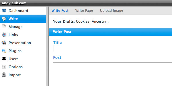
To do this, I added the highlighted line of code (thanks Paul) to line 22 of the menu.php file under wp-admin:

$submenu['post.php'][5] = array(__('Write Post'), 'edit_posts', 'post.php');
$submenu['post.php'][10] = array(__('Write Page'), 'edit_pages', 'page-new.php');
$submenu['post.php'][15] = array(__('Upload Image'), 0, 'upload.php');

So far, so good, but there were still a few issues. The ability to specifiy the upload directory has mysteriously vanished from the Options > Miscellaneous page as well. This is handled by the options-misc.php file in the wp-admin directory. Like I did with upload.php, I simply copied the 1.5 version back over, so I can now specify the directory I want my images to upload to.

The final issue was how WP 2.0 handles thumbnails, which is bizarre since I don’t know how you’re even supposed to make it create thumbnails with the current UI. Regardless, rather than using the traditional thumb-IMAGENAME.jpg it now uses IMAGENAME.thumbnail.jpg by default and with nowhere to change this option in the admin menus. Because I have nearly 200 posts and all of them have thumbnails named with the old convention, it was easier to just try to hack it back to 1.5 standards. As it turns out, this is handled by the admin-functions.php file, also in wp-admin. I basically reverted that section to the old version by commenting out the stuff that didn’t match up and pasting in the old rename function (~line 750). The result:

// If no filters change the filename, we'll do a default transformation.
// if ( basename($file) == $thumb = apply_filters('thumbnail_filename', basename($file)) )
// $thumb = preg_replace('!(\.[^.]+)?$!', __('.thumbnail').'$1', basename($file), 1);
// $thumbpath = str_replace(basename($file), $thumb, $file);
$path = explode('/', $file);
$thumbpath = substr($file, 0, strrpos($file, '/')) . '/thumb-' . $path[count($path)-1];

After all is said and done, WP 2.0 now handles image uploads identically to WP 1.5. I’m happy to say that, aside from this, everything else about 2.0 seems fairly good. I really like the live preview option that lets you view the post in its intended environment before going live, especially for instances like this where I’m using certain classes for the first time. I can’t honestly say that I took advantage of a lot of the other features in WordPress so I don’t notice a huge difference between the two versions, especially with the Tiger plugin obscuring the new UI design.

Overall though, I’m glad it’s over and done with, and the average WordPress user won’t have nearly this much trouble with the upgrade.

This is it. »

First things first. Here’s version 11, and it’s in beta. Which means that if you see anything you think is awry, let me know. If possible, a screenshot and the url of the afflicted page(s) will help immensely.

Anyways…

Alista has a thought-provoking article on using CSS to apparently *ahem* think outside the grid, something I obviously did with this site. Whatever. From what I read of the article, it seems to be a little misguided and confused. But the comments are gold. At least I can take consolation in the fact that other designers agree that Alista is not 100% infallible.

The grid discussion comes on the heels of not only the redesign of my own site but PDF’s recent article about structure. He observed about his own site:

I tend to carry the structure of the HTML that makes up a web page into its presentation. What I mean by that is most of the block elements tend to stack on top of or next to each other rather than flowing in, around or through each other. Even if the layout isn’t built on a fixed grid, there is often that clear separation of elements defined by right angles and gutters.

This is one of the biggest design commonalities Paul and I share. I don’t think this is a bad thing – it’s always good to start with a grid, which is why Alista’s article seemed so ludicrous to me. I could continue to elaborate, but I’m not saying anything the aforementioned comments already said.

Viva la Grid!

Forward »

What’s going on? Where are all the words, and the pictures?

Yeah, sorry about that. I’m just not feeling it lately, and so I finally decided to skip a day or 3. It’s not that I don’t care about the site anymore; it’s actually scheduled for a relaunch in a couple weeks. Rather, I want to break away from the daily posting because I’m running out of both words and images. I’d like to move toward a couple posts a week, each with something worth reading and looking at. I want to do more series’ of photos but I’m not big into winter photography, somehow.

In the meantime, here’s a Ferrari Enzo with some hidden meta that will make itself available on version ALeven. LOOK OUT!

Slick »

Man, I miss that Lotus. Anyway, I figured it was about time to replace my wallpaper at home, so here’s a copy for all the single-monitor peasants out there: sixteen, twelve, ten).

Settle »

I’ve mentioned before that I tend to have issues with color. On the other hand, there are some times when I’m working that a color scheme or I like happens to fall into place while I’m just screwing around. Such is the case with those shown above, because now I’m thinking about keeping them. The question is, do I continue to try to work them, or do I use them as is since I like them now? I find this to be kind of the eternal paradox of graphic design. Yes, I could go forth with the rough concept that happened to fall into place, but would I be slacking off by doing that or just working efficiently, or just lucky? If I do proceed with that and finalize it, it almost feels like I’m taking the easy way out because I’m not painfully exerting myself and stretching my abilities to their limits.

This is when you have to start thinking about scale. How important is this project, and what kind of lifespan is it going to have? I could understand the weeks or months of struggle if you’re developing a new identity for, say, AT&T. On the other hand, if you’re working on a catalog with a lifespan of a month, chances are you’re not going to spend nearly as much time developing the look since it will be gone and forgotten before long.

Which brings me back to my dilemma. In this case the colors and design in question are for a personal project which in a way adds another complication. When I’m working on stuff for my actual real job it’s easier because of the aforementioned short lifespans, but also because there are others involved on the project so I don’t have to completely rely on myself for feedback. There are certain times where I get to a point in a project and just can’t do anything else with it. At this point it helps to see the marketeer in charge because I can start to refine it or add things I missed or remove things that are unnecessary, which means that whether I like it or not I have to continue to work until we are both (hopefully) satisfied.

Not so at home. I could call it a day if I wanted to on this project and proceed to the next steps and stare at it and feel guilty about not having put more thought into it, or I could continue to waste time on trying to make it look better when I really like it right now. Damned if I do, damned if I don’t.

Protect »

A surprisingly clear picture from the phone that goes along with a recent lunchtime discussion about Wal-Mart lobsters.

But speaking of protection, the thought has been nagging at me for some time now that I really should back up my database somehow so if anything ever goes awry I can at least have a recent restore point. I found this one at Skippy.net, which gives you a plethora of options for saving – you can have your backups saved to your server, emailed to you, or just downloaded straight to your hard drive.

It gets even better. If you are too lazy (like me) to make yourself back stuff up with some regularity, install WP-Cron and it will email you a nightly backup. Plus, in addition to the standard WordPress tables, it’s also nice enough to let you remember anything else that might be in that database if you tell it to when setting it up. You know, like ShortStat junk.

Recycle »

Anyone with eyes will note that I’ve managed to pull yet another new refresh out of this site (looks familiar, eh). I swear to God, CSS is both a gift and a curse to someone as perpetually dissatisfied with their work as I am.

Literally the day after the last update I was already trying to figure out how it could be better. I’ve worked around the issue that resulted in the background shifting as the browser window narrowed by assigning a background to the wrapper instead of the body. This resulted in the problem of the background not extending the full length of the screen, but this new taller footer fixes it for all but the one-sentence slacker entries.

I mentioned before that I was considering moving to a different column structure. As much as I want to, I cannot do five columns. 1050 pixels is simply to wide for anyone who’s not me. The other natural option was 3 columns, but I don’t see that being a satisfactory solution at this point either. So for now I stick with four columns and hope that I don’t need to redesign again for another, say, 3 months.

Kilo »

I have this nagging desire to widen the site to 1050 pixels. That’s a lot. I can’t do that. I could take a column away and be at 630 pixels instead, but I don’t know that that’s the solution either. But what is? Eight? No. I guess I sit here trying to figure it out.

es rever se »

More wallpaper (sixteen, twelve, ten).

Paul McCartney and Dan Brown’s Angels & Demons, eat your heart out – I’m all up ins with the ambigrams.

Maybe not so much. Check this dude.

Century »

100 posts. But which one is your favorite?

Split »

An outing to an estate sale yesterday resulted in the purchase of four books, among them Michael Crichton’s Prey. It was so good that I read through the entire thing yesterday and would not hesitate to recommend it to anyone.

As I was starting it, though, I couldn’t help but wonder which Michael Crichton wrote this book. It sounds like an odd question, but it’s funny because it seems as though he will write in one of two distinct styles. The first, seen in books like Disclosure, Airframe, or A Case of Need, is one in which the scenarios are totally possible and grounded in real life. They are things that could happen in our current society and probably do happen. They are suspenseful but could easily sit in the non-fiction section with minimal changes.

The other Michael Crichton is something of a sci-fi writer, evidenced by books such as Jurassic Park, Timeline, orSphere, all of which were made into movies. These are much more fictional scenarios, at least at this point in time. We haven’t yet cloned dinosaurs, traveled to a parallel universe, or discovered a spaceship from the future under the sea, but they are admittedly things that *could* be scientifically possible. That’s where Prey fits in as well – I guess you’d classify that and all of these as near-future sci-fi movies, because unlike I, Robot or Minority Report the world is exactly as it is now and the only thing that prevents these events from unfolding is that we don’t have the specific technology.

What’s really impressive though, is that for me both of the Crichtons’ styles are equally enjoyable. As a matter of fact, it’s almost more interesting to see how the real-world scenarios unfold because they have to remain grounded in reality.

You’ll also notice at the right I’ve debuted the “Intake” section, listing recent media consumption.

Fresh »

I guess I got a little bored and/or inspired at the same time, since the site is no longer the black & white wonder.

What really blows me away with this whole thing is that the entire process took maybe an hour. It’s this kind of situation where CSS really shines, as the entire update required changes only to the CSS, some of the PHP (more for consistency than anything), and just two (two!) new images.

I am happy with this. While I was (and still am) pleased with the structure at the initial launch, the look left something to be desired, as the black and white and horizontal lines came closer to Subtraction than I was comfortable with. The other thing that bothered me was the fact that the four main nav buttons were very similar in appearance to the section headings and therefore didn’t stand out as much as they should have.

I was also unhappy with the lack of color, and wrote that off to wanting to keep the site “neutral.” While the reasoning was good, it just didn’t feel like a site I could be totally happy with. I am much more satisfied with this iteration, as it a) fits with the season and b) will hold me over at least until the CSS Reboot in November.

Tenth »

Just a brief note about some minor site updates.

I mentioned before that the archive page now has categories on it, but thanks to PDF’s new Wicked Categories and Total Posts plugins, the categories and the page itself both have post counters.

If you’ve looked at any of my comments lately, you’ll also see that, thanks to Author Highlight, they now have their own style to separate them from the riff-raff.

Of course, thanks again goes to PDF for helping me make this junk work. Maybe his new name should be “the Genius.”

Faster »

PDF’s post got me thinking about some of the great little aesthetic and/or functional and/or usability details you find in software (both in applications and in operating systems) these days:

  • Screenshots: OS X has a couple of screenshot options. Cmd+Opt+3 takes your full screen and Cmd+Opt+4 lets you choose a specific part of your screen. These alone are perfectly well-known and very adequate, but if you press the space bar when after the latter command, it turns to a camera and you can screen shot a specific window. Furthermore, because screenshots in OS X save as PDFs on your desktop by default, it will convert a full screenshot of a multi-display setup to separate pages for each display.
  • Scroll Bars: I don’t generally look too closely at OS X’s scroll bars, but if you do look at them when scrolling, you’ll notice the background does not move; rather, the outline of the scrollbar functions as a sort of mask over the background. A neat little touch as well as one that gives the effect of motion while scrolling
  • Dragging: One of the things I’ve gotten incredibly used to with Mac OS is the concept of dragging your file onto things to make things happen. Drag your file into the email to create an attachment. Drag it along the bottom of the dock to see what apps will open it; let go to launch the file (and the application, if it’s not already open). Works for one file, works for 10. When I need to work on a Windows machine, this is the feature I miss the most.
  • More Dragging: Guess what! This works on the internerd too! Drag a link to your desktop to make a bookmark. Drag an image to your desktop to save it. Drag a non-linked image to the address bar to view the image by itself. Internet wonderland!
  • Upside-down Scrolling: By far the best little detail I’ve ever seen is Illustrator 10’s upside-down scrolling. Using a scroll mouse? Try scrolling up – it goes down! Scroll down – it goes up! Why does it do this? I don’t know! This functionality is second only to the Tools palette disappearing every time I close Illustrator. Hott!

Speaking of functionality, you’ll find that the archive now has a category list. Yee-haw!

Poles »

Saturday morning we went to the big farmer’s market that happens every weekend during the summer. It sits right next to the highway, so when you’re wandering down there you can look up and see things like this.

Part 3 in a series of cars I’m looking at. Today: the Volkswagens.

Reliability is a key factor in the cars I’m considering, so I don’t even know why these are on the list. Is it because I’ve enjoyed every VW and Audi I’ve ever driven, even the slow as dirt New Beetle convertible? Maybe. Is it because they’re interiors follow the less is more philosophy (or used to, at least)? Maybe. All I know is that they seem to be darn good cars. The Audis are unfortunately still financially unattainable for me, unless I settle for a first-year A4 with more miles than my car, and I don’t see that happening. VWs, however, seem to be depreciating to a point where they may actually become affordable. The Passat is the logical choice given that all of the engine and transmission combinations would be acceptable, and they’re available as wagons. I mostly like the 1.8T with a manual, although I’ve only driven the Tiptronic versions which have been fine as well. The wild card is the most uncommon of the 4th-gen Golfs. That’s the four-door GLS with the same 1.8T motor as the Passat mated to the 5-speed manual. I’m not even sure the car was made for more than a year, and that was 2001. Yes, you can get that same drivetrain with more power in the GTI, but this has four doors!

So then the drawback, because there always is one, is the VW’s spotty reliability. This is unfortunate because it is a major blemish on some otherwise very nice cars. I’ve heard that this is because there’s a tendency to overcomplicate things internally, and it doesn’t really surprise me. It’s just an unfortunate set of odds, given the safety and driving aids they like to fill their vehicles with.

Just briefly, props to PDF for figuring out that when you have any kind of dialogue box open in OSX (such as the “Don’t Save / Cancel / Save” menu when you close a file in Photoshop), you can use the keyboard to tell the box what option you want: pressing ‘D’ for the above box would tell it not to save, ‘C’ would cancel, etc. I’ve only tried this on Photoshop but I wouldn’t expect it to work differently in any other app. No more remorse at the non-functional tab key!

Is 1,050 pixels too wide for a site?

Ghosting »

By the time this has posted I’ll be well on my way to the Twin Cities. My parents are taking a weekend there and we’re going to go meet up with them and then just hang out for the rest of the weekend. Of course, I never leave for the Cities without a shopping list, and this trip is no exception:

I’ll be back sometime on Sunday. In the meantime I’ll have a couple ghost-posts set up so there is still some daily content.

Soon »

So it’s getting to be that time of year that students and teachers hate to think about while the rest of us working stiffs really could care less. But September means another Festival of Arts (I have reservations about linking to their site; it’s just so awfully bad) which means more even more occupation for ABE.

A new question that fall brings for this site is that of content – do I have to start showing fall-ish pictures? Is there a grey zone where I can show both, or can I show an obviously summer picture in October? Just wondering.

PDF was confused by yesterday’s post because it didn’t involve any depth-of-field blur and wasn’t a macro shot, two things which are admittedly very prevalent on this site. I am not sure whether this example proves him right or wrong.

My 50th post was 5 days ago.

Wallpaper »

The kind for walls, not computers.

Well, maybe for computers: 1600, 1280, 1024.

Crane »

Last summer I needed a photo to use on my portfolio site, and went outside behind our building to the construction site for a hotel that was going up. It was a brief photo session and I only ended up with one photo of this massive crane, but it was one I really liked, so here it is again.

Also, look who else is on WordPress.

Washinton »

I happened to have my camera with me on the walk to work this morning.

You’ll also notice the site has been overhauled. Welcome to version 10.

Huh? »

From a barrage of emails today:

Me: did I ever show you this? I think it was before your time.

Paul: that’s fun

A: yes, pencils and internet go hand in hand.

P: I’ve seen some really dope stuff using pencils on the internet. Or maybe it just seemed dope because it wasn’t pixel perfect boxes.

A: is mine dope? how about pencils on the new site?

P: looks dope. exectution of course not so dope. but that was a long time ago…

A: That would’ve been difficult to execute with css. I think.

And here’s where it turns on us…

P: Nothing is difficult with css. Like standing on your hands for instance. Without CSS it is really hard. But when using CSS, no problem.

A: I’m not even sure that’s a valid argument – –

P: I’m not sure that’s a valid accusation.

A: I don’t think it was an accusation so much as a fact.

P: You don’t know.

A: No, I do.

P: Did your mom tell you to say that?

And unfortunately, that’s where it ends. I think our brains were so dead after that that neither of us did any work for the next 6 hours. That is a lie.

Tiro »

I. Like. Puma.

Also, thanks to the concentrated mass of wisdom that is Paul the site is starting to look more finalized.

Del.icio.us »

You'd think I was talking about food except for those crazy periods.

I’ve been playing a bit with del.icio.us. I’ve kind of got an RSS reader feeder going but nothing final.

Chicken »

The first of many completely random and incoherent posts.

Both of the “chicken fight” episodes of Family Guy were on Adult Swim. Wicked-awesome!

Paul shouted out. I’m shouting back.

What is up, my dawg?

EDIT: andylaub.com 8.5 can be found here.