Andy Laub

Andy Laub is a designer & developer in the Twin Cities.

Categorized Design

Totally Accurate »

Disclaimer: I love my Mac and I love my Xbox 360.

We went to the MALL OF AMERICA over the weekend as part of our occasional “let’s pretend we’ve never been to Minneapolis before” thing that we like to do (we also went to IKEA!), and while it was enjoyable enough (and at least good exercise – did you know that a lap around the mall is over half a mile?), we basically only spent money on lunch and that was it.

But I did make one very important observation. We had been warned before visiting that Microsoft has done what we in the biz call “copying Apple” and opened one of their famed(?) Microsoft Stores at MOA. Not particularly humorous – I don’t dispute that a branded store for a company with as many products as Microsoft is useful, and putting it in one of the biggest malls ever makes sense. The issue at hand is where in the mall it is: across from the Apple Store.

Seriously.

The problem here is that Microsoft’s stores, as implied above, borrow heavily from the book of Apple in every way; it really is like they took an Apple store and changed the logo. That wouldn’t be so bad if they weren’t immediately from their “inspiration” – it was like looking in a mirror. Well, maybe a funhouse mirror. We even noticed that both (at least on the Saturday we were there) have greeters positioned front and center – I like to imagine they spend their day staring each other down when not dealing with shoppers.

But that’s not all! My most memorable mall moment is walking into the Microsoft Store after a brief visit to Apple: immediately upon entering, the floor slopes upward about 6 inches for no apparent reason and with no warning. it’s a little jarring, to be honest, because no other stores that we visited do this. I’m not going to get all melodramatic and say it’s a safety hazard – it’s just weird. I guess they must have done it so they could run wires, but what a lazy way to do things when you have that kind of money to spend.

Then I realized it’s all a metaphor, man. That little jolt you get when you enter the store is preparing you for every little nit you’ll have to deal with when using their products. Sure, they’ll get the job done, but you’ll be complaining the entire time about the dumb little shit you have to deal with while doing so.

Apps for All »

If my recent history is any indication, I apparently only become literate after Apple events.

I haven’t spent a ton of time talking about iOS apps here, but it should come as no surprise that like most iPhone/iPod/iPad users, the downloaded apps on my device of choice far outnumber those that were there originally. While I didn’t share same the OMG NATIVE APPS mentality that many did, I also didn’t become an iPhone user until after the App Store was an established foundation of the platform.

Suffice it to say, the App Store is an important facet of iOS as evidenced by the enthusiasm for it exhibited by both consumers and competitors. Those who make the excuse that apps are unnecessary when you have the web are doing just that: making an excuse. So it was no surprise when the iPad launched with the App Store already implemented, but it did bring into focus the gap between iOS and OS X.

With today’s announcement of the Mac App Store, that gap… is still there, but it’s also different. I noticed that Apple is positioning the different fragments of iLife and iWork as Mac Apps (which refer strictly to those available on the Mac App Store for the purpose of this post). Given that they’re treated similarly on the iOS App Store, that makes sense. What I’m curious about is how this new delivery system will affect the current crop of applications. There are a few in my dock that seem like natural candidates for such a thing; Adium X, Flickr Uploadr and Transmit come to mind, to name a few. However, given that we can simply download them from their respective websites, I have to wonder what added advantage the Mac App Store could offer.

It’s not that I don’t think it’s a good idea; even as a tech nerd, the idea of having what are basically “1-click installs” for all of these Mac Apps is appealing to me, and the familiarity bred by the iOS App Store means users will likely feel right at home doing the same on their OS X machine. Plus it’s one more way to get applications on your hot-sauce MacBook Air or Mac mini server. And the developer has the advantage of added exposure and being able to push updates through a more automated system.

But speaking of updates, don’t iOS Apps have to be submitted for review with every update? While that just may be part of the package on iOS, it’s very different from current OS X environment where they’re free to push updates whenever they finish them. Considering that apps are still distributable the old-fashioned way and the developer is well-known (Panic, for example), they may opt out of the Mac App Store environment completely. And is there some set of unique guidelines for Mac Apps versus “normal” applications?

Furthermore, and this is something that’s been weighing on my mind since the advent of the iPad, it’s obvious to me that Apple wants to somewhat unify the iOS and OS X experiences. I’m not saying they want to start forcing multitouch on OS X users (at least, not yet), but it is logical for them to integrate similar visual cues and behaviors on both sides (just as they do with their hardware). But I think having such similar buying experiences across two (three, if you treat the iPad as its own) platforms may confuse the issue – especially since you can buy apps for any of the three on your Mac.

I initially started typing this paragraph with the intent of naming some of the apps on my phone that I wouldn’t necessarily need on my Mac, but they’re actually mostly inherently useful in some way. That, then, begs the question – why can’t I use the theoretical copy of Pages that I bought on my imaginary iPad on my Mac too? From a technical standpoint I understand that they’re two different environments with different specs and requirements, but I don’t expect that to be as clear to the typical consumer. I guess we just need to think of the Mac as a PS3, for example, while the iOS devices are PSP’s. We may see the same titles on both but we’ll need to understand that they don’t work across the two devices (unlike the iPad’s “backwards compatibility” of sorts).

Don’t get me wrong; I do look forward to seeing how the Mac App Store changes the OS X experience. I am just not 100% sold – yet. Now that new MacBook Air, on the other hand…

The Fourth Kind »

Buying a new phone is definitely an easier decision for me nowadays.

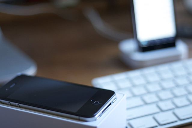
My iPhone 4 arrived two weeks ago while, fittingly, I was in the middle of what would be my final phone call from my iPhone 3G. I was caught somewhat off guard, as I hadn’t been following FedEx as closely as I sometimes do and it was arriving nearly a week before schedule. I managed to make it through the rest of the call without any sort of drooling or heaving breathing so I feel like I handled the whole situation pretty well.

The unboxing process was nice enough but I wasn’t nearly as excited about this iPhone as I had been about the 3G, mainly because I didn’t expect this transition to be nearly as drastic. I was both right and wrong about this, in a good way, so let’s break it down:

Design

This – THIS – is what an iPhone should look like. I liked the original aluminum iPhone, and very much disliked the glossy plastic 3G and 3GS so this new design is a very welcome change.

Unsurprisingly, it feels great to hold – Apple has few peers in this area. In recent history their influence over competitors’ designs is somewhat obvious, but photos can’t portray just how big the difference in build quality is. At the risk of stepping into fanboy territory, it’s often the difference between buying a gadget and a functional work of art.

Interestingly, I did run up against what is mostly a psychological problem when setting the phone down. In a situation where I’m about to put the phone on a desk or other flat surface, I’d tend to hold it with my thumb on the left, four fingers on the right, and the screen facing up. The curved back of the iPhone 3G meant that the back of the phone would make contact before my fingers, so I could then release. The flat back of the iPhone 4 results in the opposite, meaning I either have to reposition my fingers or “drop” it slightly. I wouldn’t go so far as to call it an issue as it doesn’t result in any harm to the phone; it’s just an oddity.

Experience

I found the initial startup to be a little underwhelming, actually. I think there was a lot of buildup for the Retina display and at first I didn’t notice a tremendous improvement. It is definitely nicer – a little whiter and a lot sharper, but it’s something that requires a slightly closer look for me to really appreciate. Where the difference is most pronounced for me is the app icons, as some of them are still formatted only for the old resolution and are quite grainy as a result.

What I wasn’t expecting was for the increase in performance to be so noticeable. Everything is significantly faster than on my old phone, but for me the two most useful instances of this are:

  1. The camera. It still takes a couple seconds to launch, but shutter actuation is much, much faster. It could still benefit from a bigger lens, but so could every camera ever made.
  2. Wifi. Locking the iPhone 3G would result in a loss of wifi (understandable), but it would take its sweet time reconnecting when unlocked. Not so with the iPhone 4, which retains a wifi connection even while locked (presumably for short periods of time) or reconnects almost instantly when unlocked.

The wifi in particular is an example of what Apple does well: continually refining things that were already okay until they’re great. The 3G’s wifi performance was a little annoying at times, but it wasn’t a situation where identical behavior from the iPhone 4 would’ve prevented a purchase. The newfound responsiveness has been particularly useful when using Touchpad, the remote app for our Windows Media PC.

Gripes

I may be a fanboy, but I’m not so rabid as to admit that Apple’s devices don’t have their flaws. In this case, though, I think the nits I have to pick are mainly software-based except for two, both of which are self-explanatory:

  1. More storage is always better.
  2. The camera could be better still.

Even iOS 4 is pretty solid, in that it would take me a fair amount of time to remember and compile any of the complaints I would’ve had. The only one I can think of off the top of my head is with Apple’s implementation of Facetime. I certainly understand their reasoning for putting it front and center within the in-call menu, but they did so at the expense of the hold button. This resulted in a panic when I tried to put a call on hold the first time, and the end result was not pretty.

There’s been some coverage of this already, with the “official” response from Apple being that hold is just a glorified mute button. I get that, and now that I realize there even is a mute button I find myself a bit less peeved by the whole thing. The obvious question becomes: why did the two exist in the first place?

Also, I guess they’re having antenna problems or something? I wouldn’t really know as I haven’t experienced any.

And finally, still no 3G around here. Just go suck a dick, AT&T – you guys are terrible. On that note, though, I am now on the new DataPlus plan so I don’t feel like I’m being totally robbed every month. I guess that’s an advantage.

Sixteen Candles »

I just realized I never wrote a leader for this post, so here goes: nerdery abounds at redesign time.

JQuery. I’m pretty sure that’s where this all started. A few months ago I redid my work site in effort to add a little more, well, pop. In doing so I had a little discussion with JQuery and we decided that it would be fun to hang out some more. Since then it’s been finding its way into more and more of my projects, as it’s proven to be remarkably useful.

As I become more familiar with it, it’s easier for me to see what it’s capable of (hint: everything), and as a result I started thinking about a redesign of this blog in an effort to completely and utterly abuse integrate some of those capabilities. As work progressed, I realized there were some other bullet points I’ve been wanting to hit as well. Here’s the laundry list:

JQuery

Like I said. In this case I’m using it mainly for the archive dropdown and the endless scrolling on listing pages. I played with some concepts that involved more horizontal scrolling, but decided to ultimately go a different direction.

Grids

I’ve been basing the various iterations of this blog off of grids for a long time, but this is the first time in awhile where said grid hasn’t been dictated by Flickr. In this case I decided to try a 960 grid system and ended up using a 16 column grid here, with each column equaling 50px with a 10px gutter. I used this CSS generator to develop the initial CSS.

I’m debating whether I’d use this technique if I were to do it all again as I had a couple of hangups with the process:

  • I didn’t love the naming conventions for the various classes; I ended up replacing all the underscores with dashes because that’s what I’ve become accustomed to using in my CSS.
  • The system falters somewhat if you’re floating multiple blocks inside of a larger block (for example, three .grid-3‘s in a .grid-9. You need to add .omega (to remove the right margin) to the last block in the line, which doesn’t bode particularly well for dynamically-generated content.
  • It seems like an excessive amount of markup in general. Then again, I suppose that comes with the territory in a system that’s attempting to be somewhat universal.
Dynamic Stylesheets

I’ve been wanting to experiment with adding constants to my CSS files for some time now. One way of doing this is with LESS, a Ruby gem (also available as a WordPress plugin, thankfully). LESS basically allows you to define constants and nest classes within your stylesheets, which is a tremendously useful concept.

But in short, I hated it. I attribute part of this to the fact that I had already been messing with PHP as a way to dynamicize my CSS, but the LESS system ended up being a little too clunky for me to find useful:

  • LESS does math, and that’s great. Except when it tries to divide my shorthand font declarations, and as a result the entire CSS becomes null and void.
  • It seems that commas are no less of a hurdle, as I found LESS to stumble when I was trying to define the same set of properties for two different elements.
  • As I mentioned, any issue with syntax will cause the entire stylesheet to be totally dysfunctional with no indication of what the problem is.

I ended including the CSS in PHP form, which has functioned in a much more predictable manner.

Color Editing

This is the third version of mine to feature theme-editable colors. In this case, though, I ended up going a slightly different route. I had been using a variation of the functions.php file from the old default Kubrick theme, which writes custom CSS in the header of the HTML to define the chosen color. Instead of that, I decided to make use of my newly-created PHP CSS and pass that new color to the CSS via a URL variable. Much cleaner.

In addition, I decided to make light and dark stylesheets from the get-go, which I can also switch from the admin.

Mobile Friendly(ish)

I’ve been watching with interest the recent developments in “responsive web design”. As such I decided to define an alternate version of the site for mobile devices and viewports smaller than the width of the normal site. It’s an early effort, but I’m pleased with it for now and like the rest of these points, it’s experience that I can carry forward to future projects.

And More Less

From a content standpoint, I really wanted to simplify my own presentation of myself. I decided to eliminate the “about” page for the first time in basically ever, opting instead to let my various (side) projects and social networks do the talking.

From a contact standpoint, you may notice that the comment form is no more. Existing comments have been preserved, but the ability to comment has been disabled (for now, at least). Same goes for the contact form, for similar reasons: anybody who wants to discuss an article or get in touch is someone I likely already talk to on a regular basis (or someone I would talk to). I get the whole public discourse thing, believe me, but that happens so rarely here that I felt it was no longer worth the inclusion.

So that’s it! Let me know what you think OH WAIT YOU CAN’T.

Spot on »

The iPhone 4 in two words: DAMN YES

Today at WWDC, Steve Jobs introduced the eager public to iPhone 4, the latest and greatest addition to the iPhone family. A short list of awesome:

  • 940×640 HIGH-REZ “Retina” IPS display
  • Front and rear cameras with flash and HD video recording
  • A4 processor (like such as the one found in the iPad!)
  • FaceTime video chat over wi-fi
  • All-new (albeit unsurprising) industrial metal and glass case design

So basically, it’s everything that we all knew was coming, yet the fact that it is official and will be here soon (and on my half-birthday!) is no less exciting. It’s a home run in just about every way; I’m especially excited about the new optics. My entire list of gripes can be summed up thusly:

  • Storage tops out at 32GB.

Given that iPhones have a tendency to catch up with the prior year’s iPod touch in terms of storage I didn’t think it was too far-fetched to expect the iPhone 4 in 32 GB and 64 GB flavors; instead they’ll remain the same as the 3GS which means they still can’t accommodate my entire music library (which currently weighs in at nearly 47 GB for those curious). But it’s a small sacrifice; I’ll be the first to admit that at least half of my library should never be listened to again, ever.

But the phone is just the first third of an all-important trifecta. There was a fair amount of talk about iOS 4 (formerly iPhone OS 4) as well; the iPhone demoed was clearly running that software which leaves me to assume that the new phones will ship with it later this month. I’m curious as to how that will shake out regarding the iOS 4 update for the current crop of devices.

And finally, AT&T may have actually made a decision that works out in my favor for once. Last week they announced a restructuring of their data plans for all smartphones, eliminating the $30 unlimited plan and replacing it with two new variations:

  1. The “DataPro” plan gives you 2 GB of data per month for $25, with each additional 1 GB costing $10
  2. The “DataPlus” plan gives you 200 MB of data per month for $15, with each additional 200 MB costing $15

It was difficult to determine how good of a deal this ended up being without first consulting my own usage records; as it turns out it’s rare for me to even come close to 200 MB per month. As a result, I think I’ll be able to safely downgrade to the DataPlus plan and easily knock $15 off of my current bill (and as I’ve mentioned before, price per month is much more important to me than buy-in price). And on rare occasions where I exceed that bandwidth, I’m still only paying what I was before, which is a fine compromise.

All things considered, I’m pretty pleased with this most recent round of iPhone news.

After ‘shock »

Meet the new Bioshock, same as the old Bioshock. In a good way.

The Matrix is a great movie. Somehow, in an age where we thought we’d seen everything, it managed to bring something completely new and innovative to the action/sci-fi genre in terms of both plot and filmography. It’s a film that is wonderful all on its own, which is why there were tremors of confusion when the Wachowskis announced it would be a trilogy.

Similarly, Bioshock is a great game. If you wanted, you could call it innovative simply because it was a first person shooter in 2007 that didn’t have you fighting aliens or Nazis. But beyond that, Bioshock furthered gamers’ assertions that games could indeed be art. The plot, while still dependent on you fighting your way through… things… was refreshing in the context of this beautifully creepy underwater world. And, like The Matrix, Bioshock has that single moment of clarity in which the jarring reality of things completely blows your mind.

Of course, it could also be argued that Bioshock didn’t need a sequel. And I agree; the game is a work of art that begins and resolves an interesting story, and I would’ve been content with that. But 2K didn’t agree, and so Bioshock 2 is upon us. Like many jaded gamers, years of Tony Hawks and Call of Dutys have made it clear that not all sequels are good sequels. And when I first sat down to play this new installment, it was with much skepticism.

(I could go on an entirely different rant here about how reading reviews and previews of games can drastically and irreversibly alter someone’s opinion of them for better or worse, but I will save that. For now.)

Suffice it to say, I had been reading a lot of reviews of Bioshock 2 because I was genuinely looking for an excuse to skip it. Reading reviews is not something I do for games that I know I want to play, for reasons stated above. But the reviews all played the same tune: yes, Bioshock didn’t need a sequel, but here is one, and it’s pretty good, so get over it.

And they’re right. Unlike the rest of The Matrix trilogy, this new Bioshock turns out to be a lot of fun for those of us who enjoyed Rapture the first go-round. While it would’ve been impossible to do anything but put you in the (very heavy) shoes of a new protagonist, the strategy works. You get to experience some things that are only made possible by who you are in this game, and another layer of the Rapture saga is revealed as well.

All in all, it comes down to this: the original game is so highly-regarded partially because there was a certain novelty about it. That the second installment is enjoyable and interesting even now that that novelty has worn off speaks volumes about how ripe the setting and gameplay are for further exploration.

A Brief Recap of the 2010 Chicago Auto Show »

I love Chicago and I love cars, so this seems like a match made in heaven.

When I was younger, I went a couple times with my dad to the Greater Milwaukee Auto Show. At the time I considered it to be the greatest thing in the world, as I was interested primarily in new cars and that’s what I got.

The thing with the Milwaukee show is that it was put on by the car dealers of Milwaukee, so the exhibits were limited to whatever cars they had on hand (which were admittedly nice), and anything above and beyond that could only be considered a favor from the manufacturer (like such as a concept car that’s already made its rounds to the “big” shows).

I returned there as an adult (debatably), and while it was still enjoyable, I decided next year it would be worth the extra time to check out the Chicago Auto Show – a “real” industry event that takes place around the same time, but where manufacturers are happy to spend all kinds of money to get you take a second look at their offerings.

2010 marks the first year I’ve made it back to the show (or Chicago, sadly) since 2006, as life and general apathy seem to have gotten in the way in the successive years. But finally, finally I committed to getting back down there, and had a great time in the city, only a minor part of which was spent at the auto show itself.

Notable Inclusions

I don’t know that there were any cars that I was genuinely surprised to see there. Perhaps the Fiat 500, since it’s a car not (yet) sold here. Same goes for the Equus, the new top dog from Hyundai. I was happy to see the new Mercedes SLS and Lexus LF-A in the flesh, since they’re both cars that will probably never see the likes of Wausau. Fisker made a welcome appearance, as did the Lotus Evora and a pair of Lamborghinis.

Notable Exclusions

Saab was missing, which was disappointing but not a huge surprise given the turbulence of the brand lately. I was really hoping to see the new 9-5 and 9-4x but I guess I’ll have to wait for them to recombobulate themselves. Also notably absent was Porsche (although it was represented by a local dealer so I did finally get to see the Panamera) and other high-dollar offerings like Bentley and Ferrari. Edit: also Tesla.

Best Display

My first instinct is to give this one to Audi, since they decided to make all of their cars the same color (and it’s my favorite color). Scion also had a strong showing despite not having any interesting cars. In terms of the vehicles themselves, though, it’s hard not to like Ford. Between the 2011 Mustangs, the Fiesta, the new Focus (finally), the Taurus, the Raptor, and their myriad of other great vehicles, it’s hard not to have a lot of hope for the American auto industry.

Worst Display

While there were a fair number of merely average displays, only a few qualify as completely phoned in. The Fiat display was nothing to write home about: two cars and two models, roped off from the general public. All four were boring. The Maserati wasn’t much better; it just sat there lonesomely on its turntable, surrounded by Fiats and Chryslers. Honorable mention goes to Land Rover for leaving all of their cars locked (dicks!).

Best of Show

Despite the recession, there were a lot of great cars this year. The SLS is certainly a looker, and I was actually really excited about the Toyota FT-CH concept (NERD!) because it embodies everything I want to see in the future of day-to-day cars: creative design elements, smart packaging, and an efficient powerplant.

Worst Place

Again, there was a lot of good, and a lot of average, and very little that was just unequivocally bad. But there was one car there I could never, ever, EVER spend money on, and that would be the smart. Completely useless in pretty much every way, and to add insult to injury, it’s way overpriced. It’s like a MINI with none of the fun or practicality. Worst concept goes to the Chrysler Lancia Delta… thing. As Autoblog said so eloquently:

You are looking at… well, no one at the Chrysler booth seemed to know exactly what this is. They didn’t even have a proper name for it.

And it’s true. It was just… there, the wallflower of the Chrysler display. It wanted our attention but nobody could say why it deserved it.

Defining Moments of 2009 »

I'd be remiss if I didn't do something to commemorate this arbitrary changing of years.

Last year I introduced the new year by participating in what had to have been one of the lamest questionnaires ever. This year I feel the need to again look back on the year that has just passed, but I want to do something that’s a little more original. Instead of a bunch of arbitrary questions, I’m choosing one event or experience from each month that has held the most significance in my mind.

The year started strong. January didn’t bring the same drama this year that it brought in 2008 (thankfully). Instead, I get to point out that that was the birth of the current iteration of this website.

February was relatively uneventful as well, aside from preparing for shows. But I did put together some awesome LEGO.

I spent a lot of time complaining about the weather this year, as I was already raring to get back on two wheels when March rolled around. That was only exacerbated by the new toy. The day trip to Minneapolis to pick it up was awfully fun too.

In April I put new wheels on my car. No, I mean I put them on. By myself.

May brought the first of a number of shows last year: The Last 5 Years, in which I was approximately 50% of the cast. It was a great experience and the theatrical accomplishment that I continue to be most proud of.

Then Godspell happened in June, and that was awesome too! Great cast, great technical staff, great venue, and a great show. Probably one of WCT‘s best, ever.

Things wound down a bit in July, but we had the official Godspell reunion / cast party up in Tomahawk. AKA Real World: Godspell. TEXT MESSAGES!

August was a quiet month, so I spent a lot of time on the bike, and did my first (and second!) 40-mile ride(s).

After years of planning and months of labor, Citizen Wausau 2.0 was finally launched in September, much to the excitement of those involved.

In October, I ran.

The only potentially negative item on the list happened in November, when I passed out on stage. Even then, it’s just something that happened, but I don’t think of it as being decidedly “bad”.

I had such a great vacation in December, you guys. Seriously, it was wonderful. Plus it was my birthday!

Stubborn »

New Super Mario Bros. Wii is pretty great, except for the "Wii" part.

After what seems like decades, Abe and I finally have a week where we don’t have extracurricular activities eating up every evening. Thanks to a Target gift card and some smooth talking on my part, we decided to spend some of that time with New Super Mario Bros. Wii.

We played through the first world last night, and looking back I think I enjoyed it. The game looks great, and we did a decent job of remaining alive (a definite plus) and so I hope that trend continues. Similar to 2006’s New Super Mario Bros. on the Nintendo DS, this game is a spiritual successor Super Mario Bros. 3 from the NES days. A prime choice; I consider SMB3 to be the pinnacle of Mario side-scrollers. So all is great, right? Well… no. While the game in and of itself has a lot of potential, there were also some attributes that really felt detrimental to the whole experience.

The big news in NSMBW is that you can play with up to four people simultaneously – no waiting for your turn; everybody’s on the screen, all the time. Except when they’re not. Unfortunately, it is possible for players to find themselves scrolled right off the screen, which can be overcome but may also result in death if they’re beyond the threshold of what the game decides is “safe”. Fortunately, the deceased player will quickly return in a bubble that you need to pop to get them back into the action (imagine Baby Mario in the Yoshi’s Island series).

Player interaction is another iffy item. For better or worse, your characters cannot all occupy the same space at the same time. This becomes problematic when two overzealous teammates decide to tackle the same obstacle simultaneously and instead end up as obstacles themselves. You can overcome this by constantly trying to call out your plans (“okay, now I’m going to jump on this Koopa”) but that seems like a strange thing to need to do for what should be a relatively casual experience. At the same time, it really does add to the atmosphere of the game and make it more interesting.

The biggest problem with this game, though, is where it is. My opinion is and always will be that the Wii platform is a hinderance to “normal” games. The controllers suck, not only in a physical sense but in an “it takes me 5-10 minutes to even get them to work” sense. By the time I’ve gotten the console to function I’m already beginning a game with a feeling of disappointment. Maybe it’s a repetitive fluke (oxymoron?), but how can Nintendo expect the console to appeal to non-techy casual gaming types when they can’t reliably sync their controllers to their consoles?

And while I realize that motion control is the Wii’s bread and butter at the moment, I think it’s ridiculous that they feel obligated to tack it on to every game just because it’s there. Making the game rely on motion control means that we are stuck with the basic Wiimote turned sideways (ugh, just like Super Paper Mario) instead of being able to use a Gamecube controller, the Wiimote/nunchuk combo, or the classic controller.

And that interface! Still so terrible.

Wrapped, Again »

Such an appropriate title that it needs to be recycled.

Back in February I talked about a show that I was going to be part of called The Last 5 Years. Rehearsals for that picked up in early April and posting here (at least as far as articles of substance) correspondingly became few and far between.

Well, the show ran at the end of April/beginning of May and went absolutely great. We got so many compliments, and the Jefferson Street Inn totally delivered as a venue – seriously some of the nicest staff ever (thanks for the cookies). Shortly thereafter… actually, that’s not accurate; while L5Y rehearsals were going on, auditions and rehearsals for Godspell also started. I’m not going to go into details here with regards to the story of the show (uh – the bible, basically), but I will say that there were a couple weeks in April in May where I found myself totally overwhelmed with the prospect of a) working on two shows at once and b) catching up on the second show after the first show wrapped. There were some rough nights as I struggled to pick up choreography that I was absent for, and to experience that bond that actors get after they’ve been seeing eachother on a daily basis for 3 weeks in a row.

As June rolled around I was still stressed but starting to feel better about things. As though I didn’t have enough going on, I also was trying to squeeze in a daily bike ride and manage the graphic design for the show, which required not only materials for Godspell “the show” but also the imaginary band we created – but I digress.

Because both shows are so great, Abe jumped at the opportunity to direct both of them, leaving him in basically the same boat as me. His vision for Godspell (an interesting attribute of this show in particular is that it can really be set where ever you want, as long as it involves people coming together and forming a friendship) was that it would take place after a massive rock show at the Grand Theater. Thus, the setting for the show could remain as it had been during the concert, and the actors are “fans” of the band that have hidden away in the theater and snuck back on stage after the crowd departs.

So if you’re going to have a rock show, and fans, you need a band. Thus, The Almighty was born. And with the Almighty came posters, CD covers, and T-shirts, plus a generic graphic that could be easily applied to other items.

End digression. Anyway, so yeah, as if being stressed about acting weren’t enough, I was also stressed about the identity for this imaginary band. But in the end, everything clicked.

It would not be a lie to say that this is the most amazing show I’ve ever been apart of. I’ve enjoyed pretty much all of my stage experiences, but this one in particular stood out as the perfect storm of really great material, a strong and original vision, and a cast and crew who came together to produce what we’ve been told over and over is one of the best theatrical experiences they’ve had in a very long time. I really want to thank everyone who had a part in it, because everybody gave it their all and it shows.

I think everyone has their own way of deciding whether a particular performance was strong – I definitely reflect on my own contributions and try to determine what needs to be adjusted. But I also really enjoy trying to read the audience. I suspected we had a winner when there was screaming (of joy, obviously) after the first big song. I knew we had a winner when the standing ovations were immediate, every time. If you’ve ever been to a play, you know what I mean. Sometimes the audience won’t stand at all, or will stand reluctantly and gradually because a couple overly enthusiastic people jumped up right away. That was not the case here. As we lined up on stage, before we even got a chance to bow, butts were out of seats.

And now I’m thinking about it and feeling a little sad. I’m so proud of what we were able to put together. I mean, I’m really proud of my work in Last 5 Years, especially the singing that high, that much for 6 shows and not losing my voice part. But like I said, Godspell was a perfect storm. Of awesome.

What I like about iPhone OS 3.0 »

One more iPhone post before I move on and find other things to complain about.

I’m not sure I can describe how I felt at the end of Apple’s iPhone event yesterday. Indeed, it was two hours spent talking about what to expect from the next major release of the iPhone OS, and while that actually affects me now (yay), I think I found myself in kind of a neutral state afterwards. I am certainly glad to see progress being made, but the new features and fixes don’t generally hit close to home for me.

Copy and paste is a welcome addition, obviously, as is MMS for those that actually use those. The additional calendar protocols are nice to see, although Google Sync addressed that issue a month ago. I don’t know how useful Spotlight will be, as I don’t think I have a lot of things that I have lost on my phone, but it will be fun to mess with.

But two features stood out and have me eagerly awaiting the magical summer day when I plug my phone into iTunes, and after it stalls and I have to restart it one or two times, I can finally download iPhone OS 3.0:

  • Landscape Mode for Mail, Messaging, and Notes
    Just, seriously, duh. I never really understood why Safari was the only app to make use of the big horizontal keyboard; especially since that is not where a typical person would be doing the brunt of their typing. So I am really glad to see that option proliferate to the other apps that badly need it.
  • Note Syncing
    Assuming this is implemented well, I am excited about it. I don’t use a ton of notes, but I really like the option to sync them from my computer. Now that I think about it though, a wireless sync would be even more useful than having to deal with iTunes just to update my grocery list. Oh well, we’ll see.

All in all, though, I can’t complain too much because it’s all free and it only makes the iPhone better.

Unsimplification »

I like buttons. I like pressing instead of sliding.

Apple is a strong advocate for keeping things simple. This is especially evident in their hardware design, as one may gather from the fact that most of their hardware has only one switch or button. And generally, this strategy seems to work like crazy for them, effectively setting them even further apart from their competition.

However, there are some decisions that can be subjectively classified as missteps on their part. The new iPod shuffle is a demonstration that maybe not having any controls on the device is an idea that should’ve remained on the drawing board. I can’t say for sure as I haven’t played with one (and probably never will), but most of the complaints I’ve heard thusfar have centered around the decision to take the controls off of the device and make them part of the component that you’re more likely to replace or lose (the headphones). I don’t disagree with that particular sentiment, as having to carry specialized headphones for two different devices (iPhone and shuffle) is a concept that seems vaguely, uh, mentally deficient.

The one-button mouse, while an Apple icon, is another great example of their overzealousness for simplicity. The Mighty Mouse is a drastic improvement in terms of functionality, but only when you compare it to their previous offerings. Beyond that, it doesn’t offer much that can’t be found in even the cheapest optical scroll mouse. The scroll ball is nice – until it stops working, as it has now in every Mighty Mouse I’ve owned.

But the device where the button shortage bothers me the most is the iPhone. I pretty much despise the whole “slide to do whatever” mechanic – I would love to have the option to turn that off and just use some combination of the hardware buttons to bypass it. I’d even be fine if they used the Accept/Decline buttons that are present when the phone receives a call while unlocked. I don’t enjoy sliding my fingers around the screen for no reason; especially when it’s in an attempt to accomplish something that’s more easily achieved by pressing a button.

And that’s the crux of the matter. There’s no question that Apple makes some amazing products, but sometimes it seems they favor perceived simplicity to actual simplicity.

Fourteen: A Postmortem »

The king is dead. Long live the king.

I launched version 14 of this site, officially, on May 1, 2007. That seems like a really long time ago, especially by my standards. I’m not sure how long I expected it to last back then, but I knew that I was pretty happy with it, especially considering how quickly it all went together.

Comparing the launch version to version 13 before it, it’s not hard to see what I felt was working and what wasn’t. A good portion of the content styles and graphic elements made it to the new site unscathed, while dropping the heavy-handed and overly divided feel of the previous design.

The Grid

Version 14’s major defining element was the grid based entirely on the Flickr photos at the top. Initial versions had nine 75px columns separated by 5px alleys, and in November 2008 I added a tenth. While it’s not a new thing for me to have grids defined by the size of my images (as evident in all of my site designs back when this was purely a photoblog), this was the first time I gave myself more than four columns to play with, and I really enjoyed that flexibility. I think the layout worked even better on pages where the Flickr photos weren’t visible; there was still a strong sense of grid and organization, but without the obvious indication of where it was all coming from.

Content Separation

The other major stylistic decision was the way status/blip/link posts were presented when compared to the regular journal entries. After experimenting with different options I ended up with the meta for the posts in the center column, while short posts would live on the right and full posts on the left. It worked best when it was populated evenly, but there were many times where compulsive Twittering would leave the home page entirely empty on the left column.

Then & Now

So how does this newest version compare to the outgoing iteration? You can see that while I haven’t done much with it yet, the grid concept remains intact.

In terms of visual carryover, though, that’s about it. The overall look of the new site was influenced heavily by those wallpapers I just did and my portfolio. I continue to use Helvetica for the headers, but I’ve moved back to Lucida for the body copy, which harkens all the way back to Version 8.x, as ever since then I’d pretty much used Helvetica for everything.

The dotted lines, which I have dearly loved for a very long time, are hanging on by a thread. Because I’m not using a white on white on white layout this time around, everything is divided by blocks of color and shading, which means borders as a whole just aren’t necessary.

Finally, the Status/Twitter posts have become the foremost bit of information on the new site, with Flickr taking the slot below that and the Journal even further down. This just seemed like the only way it could work, organizationally. I didn’t feel that the Flickr content was deserving of the most prominent spot on the page, and the Journal couldn’t be at the top simply because of length. As-is, most visitors should see all three sections when they visit and be inclined to scroll down. Or everybody reads this in RSS, in which case it doesn’t matter anyway.

All that said, I’m quite happy with this latest version, and I’m most interested to see what it evolves into as time progresses.

More Dash »

How can something that looks so good look so bad at the same time?

Last month I spent some time rambling about Microsoft’s new dashboard for the Xbox 360, and the general verdict was that I liked it more than the XMB used by Sony’s PS3. But the slight preference exhibited here was just that – slight. The two experiences are both consistent, attractive, and refined enough that you can’t complain too loudly about either.

Which is a good thing, because that means I can save all the complaining for whatever that crap is that I see every time I power on the Wii. Honestly – Nintendo can do product design. They can do packaging. Even the DS GUI isn’t bad. So how did the crapshoot that is the Wii dashboard even happen?

I admit, this started out as some sort of diatribe but turned into an excuse to play with FancyZoom.

A rambling look at NXE vs XMB »

Fun with acronyms.

Microsoft blessed the Xbox 360 faithful with a dashboard update this week. But this wasn’t just any old update – this was a complete rethinking of the interface from the ground up. Their moniker for it – New Xbox Experience (NXE) – is certainly apt, and I for one find it to be a welcome change. There was a lot to like about the old dashboard, but as time wore on, it started to suffer from feature creep to the point where the once-logical layout became cluttered and somewhat confusing. A big contributing factor to this was the Xbox Live Marketplace (XBLM), as it added a completely new section to the dashboard, and was never particularly well laid-out to begin with.

But after spending a couple of days with the new dash it’s safe to say that it’s a solid improvement over what was there before, both visually and functionally. They took a page from Sony in terms of an overall metaphor – both the NXE and Sony’s dash, the Xross Media Bar (XMB), use one axis for your main navigation and the other for sub navigation. That’s pretty much where the similarities end, as the PS3’s nav stretches horizontally across the screen while the 360’s scrolls vertically.

They both seem to operate in a reasonably snappy fashion – there was a bit of slowness (mostly in the marketplace) when the NXE launched, but now it performs at a speed that feels faster than the original. Even better, it doesn’t feel like an afterthought anymore. It’s clearly intended as part of the dashboard instead of feeling like an added application on the PS3. It matches everything around it and makes great use of the new interface.

But what about the other content? The NXE presents the information in big bold boxes, so there’s rarely any guesswork to be had as far as what exactly you’re getting into. The information is the hero, and it’s provided in easy-to-read type on a pretty blue gradient. It also just seems to relish the ability to give you that information. Sony opts to use small, monochromatic icons for most functions, which doesn’t really hinder anything, but it doesn’t really make things easier to find either; I sense that most either rely on labels or memorize the icons that they most frequently use. It’s kind of like comparing Web 2.0-style information delivery to that of a 1337 Flash Developer from the early 2000’s.

While that my sound like an insult, I think it’s just very indicative of Sony’s style of doing things. They’re giving you an icon and a title; consider it a bonus if you get more information than that as it would be an aesthetic sacrifice to do so. Microsoft clearly doesn’t think that way, and never has. Their information delivery has always been dictated by space on the 360, and now they’ve given themselves much more flexibility in that regard.

All in all, I think Microsoft hit it out of the park here, and has the best dashboard experience of any console.

All You Need »

Drawing parallels between stripping, musical theatre and design since 2008.

Bear with me; I’m going to head back to theatre-nerd reference land for a minute. I mentioned a few times that I was just in Gypsy, a show about a young girl who is pushed into burlesque and stripping by her overzealous, fame-seeking mother. There’s an exchange in the show between one of the strippers at the theater and the daughter in which the daughter explains that she “can’t be a stripper because she has no talent.” To which the stripper responds, “to be a stripper all you need to have is no talent.”

To be a designer all you need to have is no talent. Stop and think about that for a second. How many terrible designers do you know? People that have no artistic skill whatsoever but still manage to extract the dollars from desperate clients who don’t know that there’s a better act just down the street.

Near the end of the show, the daughter has accepted stripping and become quite famous for it. She makes a statement during her act about being an “ecdysiast”, or one who sheds its skin, and exclaiming that “at these prices, I’m not a stripper; I’m an ecdysiast!”

With that in mind, there are plenty of truly talented designers out there, and as is often the case, they have higher rates. But at the same time, you’ll find designers charging like they’re ecdysiasts when they’re not, and vice versa. Such is life on the internerd: anybody can claim to be anything.

The bold and the beautiful »

Sometimes you pop a game in and you just know it's going to be great.

I’ve spent all of 2008 thus far slowly working my way through the annual cache of holiday-acquired games. I’m just about to finish up with DiRT, the offroad/rally racing game that I’ve mentioned before, and yesterday I started the latest installment in the venerable Call of Duty franchise.

While both of these games seem about as different as can be (and gameplay-wise, they certainly are), they share a common thread in that their graphic design has been impeccable. This is more readily apparent in DiRT, as you’re enveloped by Helvetica as soon as you load up the game. I’m serious; be prepared to budget an extra ten minutes or so just playing around in the menus; they are amazing. My favorite part has quickly become the metallic sheen on the gold/silver/bronze portions after you win races. There’s something remarkably special about it, and the menus as a whole are the icing on what is already a very strong game.

You’ll have to look a little further to be truly amazed by Call of Duty 4. Once you get to the cutscenes and mission intros, you’ll be treated to some blockbuster-quality footage. Honestly, and this may not sound great, but think of a Michael Bay movie. Not the blowing-stuff-up parts, but the exposition parts. And also Enemy of the State, that Will Smith movie. It’s just incredibly high-caliber work, and all I can think when watching is that Infinity Ward (the developers) must have been chomping at the bit to make a game that wasn’t set in 1945. Boy, did they kick some ass. All of this after the relative disappointment that was the previous installment (from a different developer), and the result is a disc full of awesome.

There seem to be an awful lot of those lately, and as a gamer, it delights me to be living in a time where games are becoming more and more powerful as a type of media. I love that so much effort and time has been into delivering not just good gameplay, but a good experience as a whole.

Now, if you’ll excuse me, I’ve got to go fire up the 360.

From Scratch »

Being a creator vs. being an editor. I prefer the latter.

I’m sitting here, trying to figure out how to start this post. Normally, I wouldn’t be writing that, but in this case it’s particularly appropriate, since the thought I’m having is in regards to my abilities to create something from scratch versus modifying an existing product and shaping it into something better.

When I started doing design work, I was very much about the opportunity to start fresh and create something from nothing. I still enjoy that occasionally, but I’ve really come to relish the chances I get to take an existing design and freshen it and push it to become better than it was.

A great example is a site we at D2 just relaunched for WXPR. It’s not particularly flashy, but the consensus is that it’s a huge improvement over the old site. The key here is that while the graphics received a substantial update, the general layout of the site was strong, and so we could focus on only improving what needed it.

Of course, some sites need more love than others, but my favorite projects are the ones where we have a solid base to work from. For me, having that one constant helps in grounding the rest of the design, which makes for a smoother process with less second-guessing.

This approach finds its way into from-scratch projects as well; Citizen Wausau’s design was the result of a wireframe that was sketched out and approved before anything moved further along. There were a number of failed attempts to capture the desired “feel”, to the point where I was tempted to throw the wireframe out and start over again. I’m glad I didn’t, because the result of all this work is – you guessed it – a solid base from which the next iteration of Citizen Wausau (still in my head at this point) will be born.

This same philosophy applies to writing. I enjoy writing the occasional post when inspired, but I appreciate that CW has Dino willing to contribute his writing talent so I can sit back and move things around after he’s done.

“Blog More.” »

I'm back. Kinda sorta.

That’s what I was told during a recent discussion with a colleague as he was “blogging on his blog“. It’s common sense, yeah. I have a blog, why not use it?

The thing here is, as soon as I start to break out of my average posting time (say, every three days), the harder it is to come back. And when I do come back, the tendency is to start out with a “boy, it’s been awhile” sort of post instead of diving into real content, assuming there was any in the first place.

My problem lately is that my creative “pie chart” is currently overtaken by three things:

  1. Design
  2. Coding
  3. Acting

The first two are pretty standard considering the recent freelance decision, but the third is unexpected. As much as I enjoyed West Side Story, it took a lot out of me and with freelance calling my name, I was looking forward to a lack of rehearsals. Suffice it to say, the lull didn’t last as long as I would’ve liked.

Obviously, both writing and photography are excluded from the list, which means this blog suffers. But here’s me, blogging more.

Socialite »

I briefly mentioned before my general displeasure with MySpace in spite of its underlying usefulness. I was hesitant to just delete my page because it was still somewhat useful if I was looking for somebody or vice versa. But recently I succumbed to another temptation that allowed me to put the final nail in the MySpace coffin: Facebook.

Right now Facebook doesn’t seem to be quite as widespread within the general populace as Myspace, or at least their circles don’t overlap completely. That said, Facebook wins out for me for a few reasons:

  • Most people use real names, and real photos
  • Widget-oriented customization means you can have all sorts of junk on your page but it still doesn’t end up being completely ugly
  • A lot of functions are handled with AJAX, so like Flickr, you’re jumping around a lot less, which in turn feels faster.
  • Seriously, not ugly.
  • I have yet to see spam.

On a related note, those in the Wausau area may have noticed the recent shuttering of WausauBlog, something that struck me as rather depressing. It’s fortunate then, that I’ve gotten together with somebody interested in “continuing the legacy” and so we’ve started to work on a spiritual successor to WausauBlog. We’re calling it Citizen Wausau, and while there will be similar content (it will have some of the same contributors), we’re hoping to work in some new features as well.

I think something snapped in me when I started to collaborate on Citizen Wausau. Part of it was a desire to collaborate on more projects with more people, and part of it was being able to work on a project that I was excited about. With that said, I am now officially for hire. Please keep me in mind of you know of anyone who needs a website, or if you want to work together. For now I’m still working at Digital Dialogue, and I’m sure I’ll continue to work with them, just not necessarily for them.

More different, more the same. »

Version 14 has landed.

So here’s a new look, and it just happens to be May 1st. I’m getting better at this “every six months” thing.

Questions? Comments?

Ketchup »

I haven't posted since March, and I apologize.

So it comes to my attention that my site is looking notoriously run-down, as though the occupant has moved on and left nothing but memories. I can assure you this is not the case. Spring is here, finally, and that means more and more distractions, but hey, what’s a journal for if you can’t make excuses for slacking off?

First of all, my Xbox: still dead. Well, maybe not. It’s somewhere in Louisville, Kentucky according to UPS, but get this: it’s on the return trip. I sent it to them last Friday, they got it Wednesday and it was reshipped on Thursday. So I should be seeing it Tuesday and we’ll find out if it’s really fixed.

In the meantime, Paper Mario: The Thousand Year Door (not the new one) continues to entertain. In fact, you’re lucky I’m here writing this at all, since I’d much rather be playing that.

We are all moved in, pretty much, mostly. There are some still-packed boxes, but who cares? The garage is clean.

Last year I mentioned a niggling desire to own a single speed bike, and so instead of spending billions of money to buy some kind of deathtrap car or motorcycle, I decided instead to make good on that. Oddly enough, the bike I chose is the one mentioned in that post: a 2006 Bianchi M.U.S.S. that was stupid cheap. It too is going to be here soon, as I ordered it online instead of going through the local shop, a decision I’ll elaborate on later.

Speaking of biking, the ride to work is obviously farther than it used to be, but I can still make it in about 10 minutes. So suck it, Grand Ave.

Finally, this site looks like crap, I know. I’m working on a new one, which may be what you’re seeing right now or it may not. It looks bad regardless because one site is decaying and the other isn’t done.

Losing status »

Digital killed the graphic design star.

Graphic design is kind of a funny business. A decent designer, generally, will have gone to school for design and been bombarded with all sorts of different art classes in an effort to teach not only the technical and correct processes for doing things, but the ins and outs of making a design look good. It helps even more if the designer has a strong artistic sense already, because it’s not something that can just be instilled in most people, only refined.

The enormous amount of work required even for relatively simple projects was enough to earn designers some respect, but In the last 20 years or so, the actual production process has been made much faster and easier thanks to affordable and intuitive computers and software.

Unfortunately, this gives people the assumption that just because they’re on a Mac with Photoshop they’re the next Saul Bass, or Paula Scher when they don’t even know who those people are. Hell, I barely know who those people are.

The obvious question that arises because of this: how does a real, bona fide designer justify his or her rates as being worthwhile in an attempt to win over the do-it-yourselfers?

Logo a Gogo »

My previous logo was a result of about five minutes of Illustrator work slapped inside of a box back in summer of 2004. In spite of this, it worked surprisingly well. Still, it suffered from a couple issues. Most importantly the A could get mistaken for an F, leading one to wonder why there was an icon for Florida. But the trait that bothered me the most was the utter lack of artistic quality. With that, I set out to fix that:

These marked an acceptable start, but didn’t quite get where I wanted to go. I still like the slab serif one, but it still struck me as too straight-edged. The one the right reminds me of RocaWear. I knew that I wanted the A and L to be paired up again, so I continued:

A little closer. The far left doesn’t convey AL so much as AI, but at the end of the row you can see it starting to look familiar. Onward:

I was happy enough with the first one that I started working it out in Illustrator, but as I finished I realized it just wasn’t there. Furthermore, it just didn’t seem quite tight enough, and I can’t believe I liked it that much now that I look at it again. The next two show definite progress toward the final, with a return to the more italicized serifs of the previous row without feeling like a Jon Hicks ripoff.

With that settled, the logo was redone in Illustrator, and finally stylized for icon applications. The one with the stars is used for Flickr, Technorati, iStockPhoto, etc, and the other two find themselves in use on Yahoo! and AOL messengers.

I really like what this new logo has evolved into. It retains the good qualities of the old logo – clean lines and a nearly square proportion – while adding that dash of extra interest that I was looking for.

The Luckiest »

Just in time for the November 2006 CSS Reboot, Andy Laub 13 is done!

It’s been over a month in the making, but version 13 of this site is finally done and fully functional. This is the most comprehensive update since the first WordPress-driven version from June of 2005.

New

My biggest goal with this new site was to really start taking advantage of the power WordPress has, and that meant a switch to themes. Once I figured out the basics I was very impressed with the options that are available and how easily they can be configured. Versions 9 through 12 of the site ran off of a clump of PHP files that pretty much sat outside of the WordPress umbrella. It really worked in spite of itself, which I think sums up my feelings about it.

In contrast, I was surprised by all the options the theme system has to offer. The search function worked right out of the box (except for one day when it mysteriously didn’t), and now I have a 404 page and real category pages.

The other big reason for the switch is the fact that almost all the good WordPress plugins rely on the theme to do what they do. The contact form is a good example of this; it’s generated using a quicktag and therefore had to be set up as a WordPress page. And thanks to pages, my menus no longer have to be hard-coded.

Improved

Usability was next on my list of priorities. I’ve already mentioned the 404 and Search pages, but I also added PHP redirects on the old _____.php pages that push the user to the current page rather than a 404. Also, thanks again to the themes, all category listings are now clickable.

You’ll also notice the wider comment display area on the single pages, and, just for jb, clicking the header now takes you home.

Just Plain Different

Aside from this pretty new design (I swear, I DID NOT steal the banner idea from Jonathan Snook!), there are two more notable changes. The first is that I’m done with del.icio.us. It worked fine for links, yes, but since installing WordPress 2.0 back in February, I haven’t been able to make it play nice with Magpie RSS. Rather, I mentioned using a Javascript approach but that didn’t please me either, partially because it wasn’t searchable and partially because something in the way it was set up never displayed properly in Internet Exploere (not even 7!).

This time out I’m going mainstream and integrating the links right into the main body. They’re pretty easy to pick out, since they don’t have titles and have a cute little border thing applied to them. More importantly, they now have times and dates applied to them, and it’s one less service to rely on.

The other big step is a brand new logo, as you may have already noticed in a number of places. For now, suffice it to say that I like it much better than the old one and I’ll write more later.

That about wraps it up. What do you think?