Andy Laub

Andy Laub is a designer & developer in the Twin Cities.

Tagged iPhone

Robot in the house »

2400 words about Android.

I (still) can’t make the case for an iPad – not yet, at least. I think it’s a brilliant machine and it’s certainly the best in it’s class, but it remains comfortably outside of “impulse buy” territory.

Still, I was starting to get a hint of tablet envy. I think the seeds were sown when my dad brought home a budget tablet obtained in the Black Friday craze, which I promptly convinced him maybe wasn’t the best idea if he was serious about getting a tablet that actually worked. He agreed, and a couple weeks later committed to a 10″ Acer Iconia – Acer’s bulkier, cheaper, Android-powered iPad alternative.

At the same time, I started scouring the internet for sweet deelz™, thinking that if I was going to join the tablet revolution it would have to be at a price point somewhere more in the territory of a Kindle Fire. Initial reviews of the Fire, unsurprisingly, were (har) lukewarm, and using one in person left me cold (double har) so I let it go. Instead I bought an HTC View at a very deep discount from a site I’ve never heard of. After a couple nerve-wracking days of wondering whether it would actually ship, it did, and arrived in my hands not long after.

Hardware

The View is essentially the Sprint-branded version of the HTC Flyer, a 7″ tablet sold both through GSM carriers with 3G and at Best Buy with wi-fi only. The Sprint version gets different CDMA radios capable of 3G and 4G (which I didn’t care about) and a black case instead of silver (which I did care about – it looks pretty great). Unlike the Flyer, the View is only available in 32GB form, but all of them were shipped with Android 2.3 (aka “not Honeycomb”).

The View has an aluminum chassis and as such feels solid and mostly well-built. Bits that aren’t aluminum are finished in a nice soft-touch material, and branding is minimal and tasteful. There is a bit of the tumor on the bottom back of the slab and I’m not sure if that’s an ergonomic decision or a functional requirement. My only complaint is that I’m just not a fan of the volume and power buttons – they’re okay but they don’t feel as well-built as the rest.

Devices that run Gingerbread require hardware buttons for Home, Menu, and Back. In a clever move, HTC made these buttons capacitative instead of hardware, and included two sets of them – one for landscape and one for portrait orientation. The buttons are hidden behind the glass screen and only illuminate when their respective orientation is active; it’s very slick.

While it’s not easily mistaken for an Apple device, I’ve been pretty pleased with the overall aesthetics and build quality. If I had to make one complaint, it would be that the wireless seems somewhat weak, to the point where I need to turn wifi off and back on again to get it to find our router.

Software, Part 1 – Gingerbread

Around this same time rumors were flying about an official update to Honeycomb (Android 3.2, the tablet-specific version) being released for the HTC tablets. Initially, though, I was stuck with Gingerbread, originally intended only for the HTC’s smaller brethren. Given its diminutive size and comparatively lower resolution (1024×600), this actually worked pretty well. The status bar at the top of the screen used precious little space and, not unlike iOS, the HTC Sense version of Gingerbread includes a quick launch bar along the bottom of the home screen.

Initially there was a lot of fumbling, and a lot more Droid Sans than I’d ever like to see in one place again, but overall I had little to complain about. I spent a fair amount of time just messing around and getting my bearings, and then seeing what there was in the Android world that I couldn’t do on a comparable Apple device.

There are a couple of interesting things that apply even to a stock, unrooted version of Android. One that stands out to me is the file system, or rather, the fact that there is a tangible file system that you can browse and manipulate (to an extent) just as you’d be able to do on a “normal” computer. I was able to download a .zip file of music, unzip it, and copy it into a music directory, where it then showed up in the music player. Neat.

I also like the direction they’ve taken with the home screen. In addition to your standard selection of app shortcuts, you can also deploy various widgets that allow you to perform simple tasks (checking email, an RSS feed, your calendar, or the weather) without having to go to an app. It’s really a smart idea and a great use of screen real estate.

Android (in stock form!) also allows apps to be sideloaded simply by changing an option in the settings. This means that you can find an .apk file (the standard format for an Android App) on the internet, download it / copy it to your device, and install it without having to ever interact with the Android Market. For nerds (like me) this is a pretty cool thing to be able to do – more on this later.

There are some other fundamental differences, but one of the more practical examples is how – and I’m going to try to effectively regurgitate this explanation – Android allows apps to more easily interact with each other while iOS keeps it’s apps in “silos”. Put more simply, if you install something like a different browser, the OS acknowledges its existence and you’ll be given the option to use it as a default app for a given action. You only see this level of integration in iOS on the built-in apps, because Apple doesn’t give access to that sort of thing to 3rd-party developers.

Overall, there is a lot to like about Android, and I enjoyed my experience with Gingerbread, but that doesn’t mean I wasn’t excited to get my hands on Honeycomb.

Software, Part 2 – Honeycomb

The rumors turned out to be true, and not even a week after receiving my View the official Honeycomb update was available. Of course I downloaded it immediately, and prepared to be taken to the next level in tablet awesomeness. At least, that’s what I was hoping would happen. Having played with HC a tiny bit on my dad’s Acer, I was pretty excited to get ahold of it and see what kind of usability improvements HTC would make, and how the experience would be more optimized for a tablet as a whole.

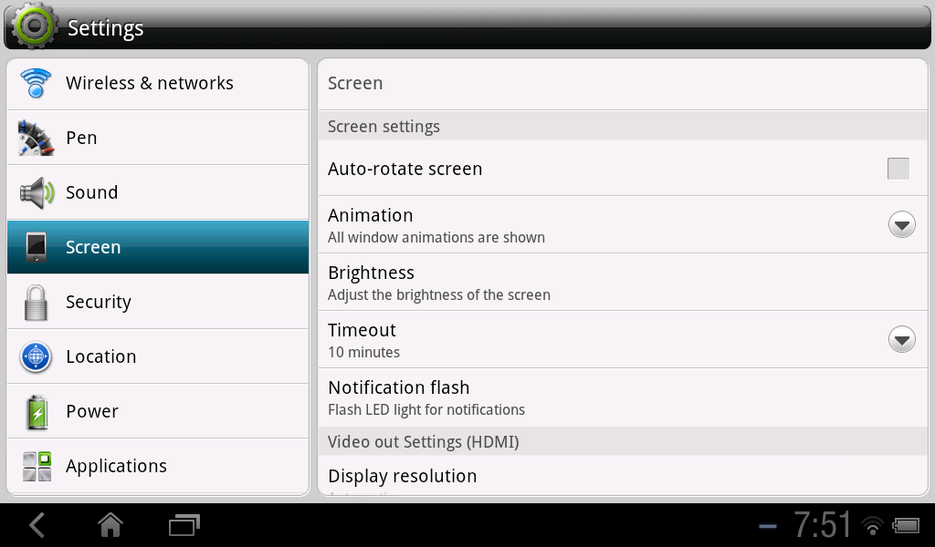
Sadly, the result wasn’t nearly as nice as I had hoped, for a number of reasons. Honeycomb itself isn’t exempt from criticism, and most of this criticism revolves around the status bar. No longer does it live unobtrusively at the top of the screen; now it is a fairly wide black bar at the bottom. Like the status bar of old, it has time and notification information as well as wireless and battery levels; these live on the bottom right corner. On the bottom left corner are new global buttons: Back, Home, and App Switcher. And sometimes Menu, depending on where you are.

If this sounds like it’s redundant, you’re right. Devices with Android 3 or later no longer require physical buttons, as they’re now built in to the OS itself as onscreen UI elements. Fortunately HTC was prepared for this – remember those capacitative buttons I mentioned earlier? Once Honeycomb is installed they essentially cease to be. Even after only a week using Gingerbread I had become extremely reliant on said buttons. Most confusing to me is the complete elimination of the Menu button from the home screen, as I was used to using that to get to some quick and useful tools like the task manager.

The other issue with this is simply the extra screen real estate that this will always require. It’s impractical to try to hide this bar within certain applications because the bar is your only way to get out of the application; there’s no other emergency exit like iOS devices’ Home button. One issue with this is that it simply takes up what seems like a lot of space on a screen with only 600 pixels on a particular side. A bigger issue is that it becomes difficult to have any sort of quick launch docked at the bottom of the home screen because there’s already important global UI there and it ends up a cluttered mess.

In a less cluttered world, I would be using this space to make minor and subjective gripes about the Honeycomb look – while I really like Google’s intent with the Holo interface overall, The icons and font in the status bar seem like they’re still trying to a little to hard to be XTREME.

Weirdly, though, I can’t complain about that because it’s time to talk about HTC Sense. It’s become commonplace in the Android ecosystem for OEM’s to add their own layer of UI over the top the stock operating system. In some cases this is as simple as throwing a couple extra widgets, but with HTC it’s much more widespread and as a result, disastrous.

HTC’s devices all ship with Sense UI layered over the top of the standard software. Aside from the iconic flip clock / weather widget, I’m not sure exactly what Sense does that benefits me. I can tell you they’ve done their best to overlap the standard Holo interface with as many heavy gradients and round corners as they can muster, and replaced the handsome and subtle stock iconography with their own colorful illustrations – they even went so far as to replace the web browser with their own abomination. It’s sad, because the widgets that they include are really functional; they’re just generally unattractive and contradict Google’s own design philosophy – just like the rest of Sense UI.

There’s a lot of talk about fragmentation when Android is brought up, and this extra layer of junk on top of an already complex OS isn’t helping things. It’s especially frustrating when I see that Google, finally, is actually trying to design things, and yet most people won’t be able to experience that design in its intended form. The Sense/Honeycomb experience is truly ridiculous, because there’s this awful layer that you can’t turn off, and yet it also doesn’t cover everything so you’ll frequently see bits of plain Honeycomb showing through, teasing you.

Software, Part 3 – Rooting

During this entire saga I had become fairly addicted to the Flyer/View forum on XDA Developers – it’s been a tremendously useful source of info for all things HTC and Android. So in retrospect it seems that my decision to root was inevitable.

For now I’m running basically the same software as before with some minor differences; once you have root access you’re able to make changes to the core files you otherwise wouldn’t be able to modify. So far my experience with this is limited to replacing the HTC web browser with a stock Honeycomb browser (which also requires removal of some other system files), removing the Sprint-flavored boot animations, and removing the program that nags for wireless (3G/4G) access since I don’t intend to use anything other than wifi.

The beauty of Android is that there’s a pretty vibrant developer community even for less popular devices like the View (especially thanks to a bunch of fire sales in December), and so for now I’m keeping an eye on two different projects that involve basically removing as much of Sense as possible in favor of a more stock experience. In my ideal world, some wonderful genius(es) would figure out how to build a useable version of Ice Cream Sandwich (Android 4).

Alternately, I will lose interest and end up buying something else.

Applications

For the most part the things you can do in Android and the things you can do in iOS overlap considerably. It’s true that there some genres of apps that simply don’t exist in iOS – things like task managers and custom launchers. I’m happy enough with iOS that I don’t feel distraught by that. However, there is one killer feature that doesn’t exist on iOS: emulators. As it turns out, a seven inch screen is the perfect size for playing backups of some of my favorite Game Boy Advance and Super NES games. Super Metroid comes to mind, perhaps with the Super Zeromission patch that brings some new territory to an old friend.

Some additional recommendations:

TL;DR

I bought an Android tablet. It’s pretty good but the software leaves me a little cold in its current iteration and I’d really like to have a more “pure” Google experience. At any rate, it’s a really fun toy to mess around with if you’re into that sort of thing.

What it’s not is any kind of worthy competitor to the iPad if you’re not into that sort of thing. People who don’t find joy in just poking around with technology and hacking things apart are better served by a platform that doesn’t inherently allow for that. There’s a messiness to it that I don’t see in iOS – it’s more wild and uncivilized.

The thing is, even as a self-professed nerd and gadget aficionado, I don’t want that messiness in a device that I have to rely on. As I said before, the HTC is a fun toy and an interesting learning experience, but I need my phone to work consistently and 100% of the time, and I need to know that it won’t simply be forgotten about by the OEM when the next big thing comes out. I like the comfort of knowing that if I buy a new iPhone or iPad I will have the latest and greatest iOS device for a full year before something new comes along and starts receiving the majority of attention, and that’s simply not a guarantee that can be made for any Android device.

I’d rather have a device I rely on be 95% perfect for its whole life (iOS) than 75% with the promise that eventually it could be 100%.

Video Killed the Instant Messaging Star »

Two video-chattin' protocols are picked to live on a Mac; can they coexist or will they stop being polite and start getting real?

When Apple announced Facetime as part of the iPhone 4’s myriad of parlor tricks, I wouldn’t say that excitement was my first reaction. Cautious optimism might be a better description: video chat is obviously a very cool and useful feature, but who would I even Facetime with?

A few months and one iPhone 4 later, I had still only used the feature a handful (har) of times. So when Facetime for Mac was announced in October, I was pretty happy to see Apple expanding the system across their other hardware. I was quick to download the beta and happy to see that it basically works as expected. At the same time, I had a nagging feeling that there were better ways to video chat with someone (probably because there are better ways to video chat with someone. Facetime is great fine for phone-to-phone or phone-to-Mac chat, but what about Mac-to-Mac? Or Mac-to-Mac-to-Mac?

It makes me wonder what Apple’s grand plan is for iChat. It’s standard on every modern Mac but is often overlooked; I suspect most users who rely on instant messaging (myself included) install a multi-service client almost immediately, while the rest have no need for any client whatsoever.

And that’s sad, because iChat is a pretty neat application for a few reasons:

  1. It’s had video abilities for years, so you can have a discussion with one person or multiple people simultaneously.
  2. Screen sharing lets you share what’s on your computer screen with somebody else (or vice versa) – perfect for giving a tutorial or presenting a document. And it works with audio chat!
  3. It’s still an IM client, so you can send links, files, or just message in realtime without resorting to email.
  4. Facetime doesn’t have any way of indicating whether the person you want to talk to is available because it’s still based off the notion of a phone call. In contrast, instant messaging revolves around availability status.
  5. It’s on every modern Mac. And it’s free.

I’ll admit to being a bit of an instant messaging (and to some extent IRC) romanticist. I feel as though I write better than I speak, so the notion of being able to type in realtime has always appealed to me. Interestingly, it seems like instant messaging these days has become more of a business tool, probably a result of those of us who grew up with it (sort of) finding it to be a tremendously versatile medium for communication, and because the younger generation has (logically) moved on to instant messaging in its place.

But what of iChat versus Facetime? For now the two occupy somewhat separate spaces, but Facetime on the Mac is encroaching ever so slightly on iChat’s territory, and bringing with it some strange new standards.

Apps for All (Except Me) »

The Mac App Store is here. Why am I not using it?

If you own a Mac and you did your software update today, it’s likely you’ve had a bit of time to play with the new Mac App Store. I know I did, and the first (and only) thing I downloaded was Twitter for Mac, replacing Tweetie as my desktop Twitter client of choice. I won’t get into a written comparison (but here’s a side-by-side if you’re curious) since it’s not that big of a deal to me.

What did occur to me after browsing the App Store further was that I don’t really care that much about it. Obviously it’s a new and different way of acquiring desktop software, and I think it’s a good idea, but I’ve probably downloaded more apps for my iPhone(s) than I have for any computer, ever. I just don’t go out looking for new Mac applications very frequently once the need is filled, and new needs come along very rarely.

I’m willing to say that most of my needs are filled on my phone as well, but the two simply aren’t comparable environments. The need I’m generally still trying to fill when I browse the iOS App Store is that of a diversion – something that no one app can necessarily fulfill. When I’m at home on my Mac, I don’t need diversionary software because I have full-bore internet, a a big screen on which to view it, and unlimited bandwidth. On the phone, however, I’m probably more likely to be playing a game that works well on the small screen and with infrequent network usage, and the web is generally relegated to tool-status like many other apps.

None of this is to say that the Mac App Store isn’t a great success; I just don’t see myself as a frequent visitor. On the other hand, it’s already making for some great entertainment in and of itself.

Defining Moments of 2010 »

See you in 2011.

I did this before. Here it goes again:

As January hit Wisconsin, we were running down the middle of the street trying not to fall on our asses. Now that I think about it, that’s a pretty good metaphor for the year.

February took us to Chicago with some friends who used to live there, and we did all kinds of good stuff.

In March I bought a camera and took some pictures.

April was not so great, but in retrospect it was actually not so bad either.

I read a lot of books in May.

In June I loved the iPhone 4. And I still do.

I relaunched this site in July. (Side note: wow, that was only July?)

I rode my first ever half-century in August, which dovetailed nicely with my first ever 500 miles run in July.

On the subject of running, I ran a 10K race (off road!) in September. So much fun!

I accidentally another play in October. Is that bad?

In November, Conan came back and I made a pie. Both were delicious.

December. Miami.

Mutually Exclusive »

The iPad ain't no notebook (and vice versa).

When the iPad landed there was no disputing its novelty, but at the same time I wrote it off as “…a larger version of a device I already didn’t have a use for.

Harsh, I know, but true. I could never really wrap my head around the iPod touch (a device made completely redundant by my iPhone), but as I’ve spent more time playing with iPads and seeing the new apps that are being made available, I’m starting to “get it”. It’s the size.

An iPad is an ideal away-from-desk computer. There are some instances where I’d like to relax and watch a video that lives on my desktop, or read an article while watching TV, or reference a game as I’m playing, where all I basically need is a screen. For now the iPhone is an adequate solution, but the extra screen space would be a welcome addition.

The thing is, I’m also finding myself more and more in need of a computer I can take with me to meetings, some of which are not local and thus require more flexibility from such a machine. It’s this away-from-home situation where a “normal” notebook computer still shines; I know that in a pinch I can browser-test in Windows, edit a file in Creative Suite, or do something as basic as charge my phone. Preparation is the keyword.

In a perfect world I’d own both of these devices in addition to my iPhone and Mac Pro which would leave me consistently covered for all scenarios. And while that day may eventually come (and probably sooner rather than later), for now the away-from-home computer has taken priority and that’s why I ordered an 11″ Macbook Air.

Apps for All »

If my recent history is any indication, I apparently only become literate after Apple events.

I haven’t spent a ton of time talking about iOS apps here, but it should come as no surprise that like most iPhone/iPod/iPad users, the downloaded apps on my device of choice far outnumber those that were there originally. While I didn’t share same the OMG NATIVE APPS mentality that many did, I also didn’t become an iPhone user until after the App Store was an established foundation of the platform.

Suffice it to say, the App Store is an important facet of iOS as evidenced by the enthusiasm for it exhibited by both consumers and competitors. Those who make the excuse that apps are unnecessary when you have the web are doing just that: making an excuse. So it was no surprise when the iPad launched with the App Store already implemented, but it did bring into focus the gap between iOS and OS X.

With today’s announcement of the Mac App Store, that gap… is still there, but it’s also different. I noticed that Apple is positioning the different fragments of iLife and iWork as Mac Apps (which refer strictly to those available on the Mac App Store for the purpose of this post). Given that they’re treated similarly on the iOS App Store, that makes sense. What I’m curious about is how this new delivery system will affect the current crop of applications. There are a few in my dock that seem like natural candidates for such a thing; Adium X, Flickr Uploadr and Transmit come to mind, to name a few. However, given that we can simply download them from their respective websites, I have to wonder what added advantage the Mac App Store could offer.

It’s not that I don’t think it’s a good idea; even as a tech nerd, the idea of having what are basically “1-click installs” for all of these Mac Apps is appealing to me, and the familiarity bred by the iOS App Store means users will likely feel right at home doing the same on their OS X machine. Plus it’s one more way to get applications on your hot-sauce MacBook Air or Mac mini server. And the developer has the advantage of added exposure and being able to push updates through a more automated system.

But speaking of updates, don’t iOS Apps have to be submitted for review with every update? While that just may be part of the package on iOS, it’s very different from current OS X environment where they’re free to push updates whenever they finish them. Considering that apps are still distributable the old-fashioned way and the developer is well-known (Panic, for example), they may opt out of the Mac App Store environment completely. And is there some set of unique guidelines for Mac Apps versus “normal” applications?

Furthermore, and this is something that’s been weighing on my mind since the advent of the iPad, it’s obvious to me that Apple wants to somewhat unify the iOS and OS X experiences. I’m not saying they want to start forcing multitouch on OS X users (at least, not yet), but it is logical for them to integrate similar visual cues and behaviors on both sides (just as they do with their hardware). But I think having such similar buying experiences across two (three, if you treat the iPad as its own) platforms may confuse the issue – especially since you can buy apps for any of the three on your Mac.

I initially started typing this paragraph with the intent of naming some of the apps on my phone that I wouldn’t necessarily need on my Mac, but they’re actually mostly inherently useful in some way. That, then, begs the question – why can’t I use the theoretical copy of Pages that I bought on my imaginary iPad on my Mac too? From a technical standpoint I understand that they’re two different environments with different specs and requirements, but I don’t expect that to be as clear to the typical consumer. I guess we just need to think of the Mac as a PS3, for example, while the iOS devices are PSP’s. We may see the same titles on both but we’ll need to understand that they don’t work across the two devices (unlike the iPad’s “backwards compatibility” of sorts).

Don’t get me wrong; I do look forward to seeing how the Mac App Store changes the OS X experience. I am just not 100% sold – yet. Now that new MacBook Air, on the other hand…

The Fourth Kind »

Buying a new phone is definitely an easier decision for me nowadays.

My iPhone 4 arrived two weeks ago while, fittingly, I was in the middle of what would be my final phone call from my iPhone 3G. I was caught somewhat off guard, as I hadn’t been following FedEx as closely as I sometimes do and it was arriving nearly a week before schedule. I managed to make it through the rest of the call without any sort of drooling or heaving breathing so I feel like I handled the whole situation pretty well.

The unboxing process was nice enough but I wasn’t nearly as excited about this iPhone as I had been about the 3G, mainly because I didn’t expect this transition to be nearly as drastic. I was both right and wrong about this, in a good way, so let’s break it down:

Design

This – THIS – is what an iPhone should look like. I liked the original aluminum iPhone, and very much disliked the glossy plastic 3G and 3GS so this new design is a very welcome change.

Unsurprisingly, it feels great to hold – Apple has few peers in this area. In recent history their influence over competitors’ designs is somewhat obvious, but photos can’t portray just how big the difference in build quality is. At the risk of stepping into fanboy territory, it’s often the difference between buying a gadget and a functional work of art.

Interestingly, I did run up against what is mostly a psychological problem when setting the phone down. In a situation where I’m about to put the phone on a desk or other flat surface, I’d tend to hold it with my thumb on the left, four fingers on the right, and the screen facing up. The curved back of the iPhone 3G meant that the back of the phone would make contact before my fingers, so I could then release. The flat back of the iPhone 4 results in the opposite, meaning I either have to reposition my fingers or “drop” it slightly. I wouldn’t go so far as to call it an issue as it doesn’t result in any harm to the phone; it’s just an oddity.

Experience

I found the initial startup to be a little underwhelming, actually. I think there was a lot of buildup for the Retina display and at first I didn’t notice a tremendous improvement. It is definitely nicer – a little whiter and a lot sharper, but it’s something that requires a slightly closer look for me to really appreciate. Where the difference is most pronounced for me is the app icons, as some of them are still formatted only for the old resolution and are quite grainy as a result.

What I wasn’t expecting was for the increase in performance to be so noticeable. Everything is significantly faster than on my old phone, but for me the two most useful instances of this are:

  1. The camera. It still takes a couple seconds to launch, but shutter actuation is much, much faster. It could still benefit from a bigger lens, but so could every camera ever made.
  2. Wifi. Locking the iPhone 3G would result in a loss of wifi (understandable), but it would take its sweet time reconnecting when unlocked. Not so with the iPhone 4, which retains a wifi connection even while locked (presumably for short periods of time) or reconnects almost instantly when unlocked.

The wifi in particular is an example of what Apple does well: continually refining things that were already okay until they’re great. The 3G’s wifi performance was a little annoying at times, but it wasn’t a situation where identical behavior from the iPhone 4 would’ve prevented a purchase. The newfound responsiveness has been particularly useful when using Touchpad, the remote app for our Windows Media PC.

Gripes

I may be a fanboy, but I’m not so rabid as to admit that Apple’s devices don’t have their flaws. In this case, though, I think the nits I have to pick are mainly software-based except for two, both of which are self-explanatory:

  1. More storage is always better.
  2. The camera could be better still.

Even iOS 4 is pretty solid, in that it would take me a fair amount of time to remember and compile any of the complaints I would’ve had. The only one I can think of off the top of my head is with Apple’s implementation of Facetime. I certainly understand their reasoning for putting it front and center within the in-call menu, but they did so at the expense of the hold button. This resulted in a panic when I tried to put a call on hold the first time, and the end result was not pretty.

There’s been some coverage of this already, with the “official” response from Apple being that hold is just a glorified mute button. I get that, and now that I realize there even is a mute button I find myself a bit less peeved by the whole thing. The obvious question becomes: why did the two exist in the first place?

Also, I guess they’re having antenna problems or something? I wouldn’t really know as I haven’t experienced any.

And finally, still no 3G around here. Just go suck a dick, AT&T – you guys are terrible. On that note, though, I am now on the new DataPlus plan so I don’t feel like I’m being totally robbed every month. I guess that’s an advantage.

Gadget Neurosis »

Oh, that was today?

As a technophile, it’s should be pretty apparent that I deal with an awful lot of gadget-lust. I’ve been getting increasingly better at shrugging it off, but that temptation becomes exponential on launch dates of particular devices. There’s something in the air on days like today; tech blogs go crazy, Twitter explodes, and nerds around the world line up outside of stores for the privilege of… giving away their money.

But you might be surprised to find that I didn’t join the masses today (or two weeks ago) considering my rabid enthusiasm for the newest iPhone. I toyed with the idea of preordering, but when the date jumped from July 2 to July 14, I figured that I’d be able to pick one up locally before then.

Yet this morning I got out of bed, did some work, ate a banana, went for a run, and came back here to write this. What I didn’t do was drive as fast as I could to Walmart (the only local reseller whose stock isn’t allocated to preorders) the minute I woke up, desperately hoping to get my hands on a shiny new toy. Don’t think that it wasn’t a major possibility.

In the last few days, though, I’ve been trying to pin down just why I so desperately wanted this phone that I felt compelled to inconvenience myself to acquire it. I couldn’t answer that question, beyond what I can only describe as a really strange sort of peer pressure, where by “peer” I mean “nerds and blogs”.

The only other explanation I can offer for this specific instance is that it’s the first time I’ve actually been eligible for a new iPhone at the time of its launch. AT&T didn’t even exist here when the first iPhone hit, and I was in the middle of my contracts for the 3G and 3GS.

But look! This is me, taking a stand.

I ordered one from the Apple Store while I was writing this.

Spot on »

The iPhone 4 in two words: DAMN YES

Today at WWDC, Steve Jobs introduced the eager public to iPhone 4, the latest and greatest addition to the iPhone family. A short list of awesome:

  • 940×640 HIGH-REZ “Retina” IPS display
  • Front and rear cameras with flash and HD video recording
  • A4 processor (like such as the one found in the iPad!)
  • FaceTime video chat over wi-fi
  • All-new (albeit unsurprising) industrial metal and glass case design

So basically, it’s everything that we all knew was coming, yet the fact that it is official and will be here soon (and on my half-birthday!) is no less exciting. It’s a home run in just about every way; I’m especially excited about the new optics. My entire list of gripes can be summed up thusly:

  • Storage tops out at 32GB.

Given that iPhones have a tendency to catch up with the prior year’s iPod touch in terms of storage I didn’t think it was too far-fetched to expect the iPhone 4 in 32 GB and 64 GB flavors; instead they’ll remain the same as the 3GS which means they still can’t accommodate my entire music library (which currently weighs in at nearly 47 GB for those curious). But it’s a small sacrifice; I’ll be the first to admit that at least half of my library should never be listened to again, ever.

But the phone is just the first third of an all-important trifecta. There was a fair amount of talk about iOS 4 (formerly iPhone OS 4) as well; the iPhone demoed was clearly running that software which leaves me to assume that the new phones will ship with it later this month. I’m curious as to how that will shake out regarding the iOS 4 update for the current crop of devices.

And finally, AT&T may have actually made a decision that works out in my favor for once. Last week they announced a restructuring of their data plans for all smartphones, eliminating the $30 unlimited plan and replacing it with two new variations:

  1. The “DataPro” plan gives you 2 GB of data per month for $25, with each additional 1 GB costing $10
  2. The “DataPlus” plan gives you 200 MB of data per month for $15, with each additional 200 MB costing $15

It was difficult to determine how good of a deal this ended up being without first consulting my own usage records; as it turns out it’s rare for me to even come close to 200 MB per month. As a result, I think I’ll be able to safely downgrade to the DataPlus plan and easily knock $15 off of my current bill (and as I’ve mentioned before, price per month is much more important to me than buy-in price). And on rare occasions where I exceed that bandwidth, I’m still only paying what I was before, which is a fine compromise.

All things considered, I’m pretty pleased with this most recent round of iPhone news.